
Manual reports take too much time and often leave room for error. With more teams working across different channels, it’s harder to stay consistent, organized, and fast. That’s where automated reporting tools step in.
These tools simplify the reporting process by pulling data from multiple sources, generating reports on a schedule, and presenting real-time insights in a clear way. You won’t need to chase spreadsheets or repeat the same work each week.
In this article, you’ll learn how automated reporting tools help teams save time, analyze data faster, and make informed decisions with confidence.
Simplify your agency’s reporting with TapClicks’ automated dashboards. Start your 14-day free trial!
General BI vs. Dashboard Reporting
Before choosing the right automated reporting tool, it helps to understand the difference between general business intelligence systems and dashboard data reporting tools. Knowing what each one does can guide your choice and improve how your team uses data.
Business Intelligence (BI) Tools
Business intelligence tools give companies full control over how they examine trends, compare time periods, and plan for the future. Unlike basic dashboards, these systems go deeper into data analysis by organizing, connecting, and calculating data from across your organization.
A business intelligence tool typically includes:
-
Data integration - Connects to cloud apps, spreadsheets, internal servers, and third-party services.
-
Data preparation - Cleans and organizes raw data for easier use in reports.
-
Reporting capabilities - Produces visual and tabular summaries across timeframes.
-
Advanced analytics - Runs comparisons, segments users, and identifies patterns.
-
Historical analysis - Tracks trends and changes over weeks, months, or years.
-
Role-based access - Lets teams see only what they need, without exposing everything.
These tools help data scientists and analysts answer big questions like: What happened last quarter? Why did it happen? What’s likely to happen next?
While the power of these platforms is clear, the steep learning curve can’t be ignored. Many teams need extra support to use the full feature set, especially when dealing with complex data.
Still, when configured correctly, BI tools help companies make informed decisions by connecting systems and surfacing meaningful insights.
Dashboard Data Reporting Tools
Dashboard data reporting tools focus on real-time visibility. Instead of running large queries or digging through tables, you can track performance through a user-friendly interface and a drag-and-drop dashboard builder.
Unlike traditional business intelligence tools, dashboard platforms are designed for daily use by marketers, sales teams, and managers who need fast answers. Most connect to common apps like Google Ads, Shopify, and CRMs, pulling data in automatically to show real-time changes.
Key features often include:
-
Customizable dashboards - Users can choose the metrics, charts, and layout that matter most.
-
Interactive dashboards - Let viewers filter, click, or change views based on role or goal.
-
Scheduled report delivery - Reports go out by email, PDF, or shared link, removing manual effort.
-
Real-time data integration - Connects tools like Facebook Ads, Google Analytics, and email software.
-
Reports and dashboards - Often unified in one view so users can switch from quick overviews to deeper analysis.
Dashboard tools make it easier for teams to track short-term progress, stay aligned on KPIs, and spot issues early without sifting through rows of data. If you need automated reporting that’s simple and accessible, dashboard tools are often the better choice.
Missing Features That Limit Standard Reporting Solutions
Many traditional platforms claim to support automated reporting, but these tools often fail to meet the demands of modern teams that need full visibility, instant delivery, and smarter analytics. Let’s look at three common gaps that slow down the reporting process and reduce report quality.
Limited Integrations With Traditional Marketing Channels
Some tools only connect to a few well-known platforms like Google or Facebook. Others skip over TikTok, Spotify Ads, or direct-buy networks.
When your tool lacks these links, you’re stuck downloading spreadsheets or copying metrics from one system to another. These manual reporting tasks waste time and lead to inconsistent numbers.
For teams managing campaigns across multiple platforms, weak data integration creates blind spots. You can’t act on what you can’t see.
Missing sources can delay your decisions and limit the value of your automated reporting tools. To keep data complete and current, your platform needs to pull from every major data source, not just a few.
Lack of Automated Data Analysis
Many tools collect and organize numbers but don’t interpret the results, show patterns, or flag problems. That leaves you digging through pages of charts to figure out what’s wrong or what to fix.
Without built-in smart features like trend alerts or performance benchmarks, you do the hard part yourself. It slows progress, especially when every new campaign needs a fresh review.
High-quality automated reporting software doesn’t just present metrics. It should help teams analyze data and turn it into actionable insights that support data-driven decisions.
No Automated PowerPoint or PDF Report Generation
While dashboards are useful, many clients and executives still expect scheduled email reports, printed summaries, or slide decks. Most traditional tools don’t support this. You’re stuck exporting files manually, copying screenshots, or assembling charts one at a time. That’s not scalable.
If you can’t create automated reports and deliver them as PDFs or presentations, the process becomes tedious and error-prone. This kind of manual work leads to version control issues and puts data accuracy at risk.
A better tool supports both live dashboards and downloadable formats, which help you send out comprehensive reports on time, every time.
6 Automated Reporting Software to Visualize Data
The following are the six best automated reporting tools you could use for data visualization.
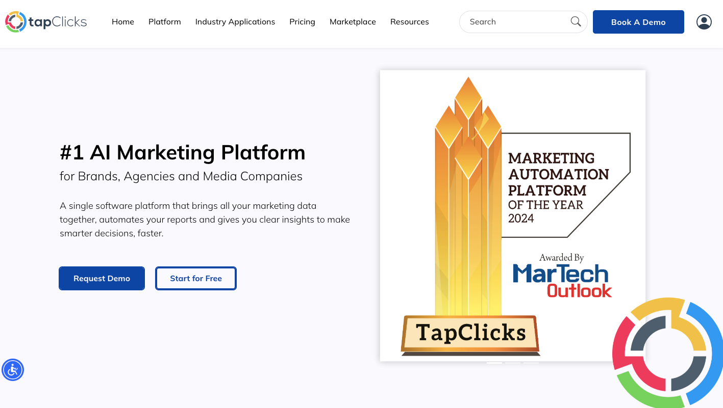
1. TapClicks
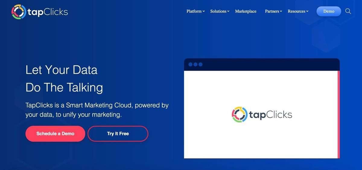
TapClicks is a marketing dashboard reporting tool that allows you to fully control your report generation process while maintaining ease of use.
TapClicks supports automated data calculations, cross-platform analytics, and scheduled PowerPoint or PDF report generation. The platform also integrates with major marketing platforms, CRMs, and financial reporting tools for tracking key performance indicators.
Eliminate manual reports and build smarter campaigns with TapClicks. Book a demo today!
Ways TapClicks Automates Reporting Tool for Agencies and Marketing Teams
TapClicks removes busywork from the reporting process so marketing teams and agencies can spend less time collecting data and more time analyzing it. These two features make it one of the most effective automated reporting tools available.
Connects to Almost Any Ad or Marketing Platform
TapClicks supports over 250 instant-on data connectors, which saves you from having to manually import performance data from external sources. What sets it apart:
-
Instant-on integrations - Pulls live campaign data from platforms like Google Ads, Facebook, LinkedIn, AdRoll, AppNexus, and Verizon Media.
-
No code setup - Marketers don’t need to manage APIs or write scripts.
-
Smart Connectors - Daily updates for tools not in the native library.
-
Data accuracy - Reduces errors from manual imports.
-
Real-time insights - Always displays current data for performance reviews.
-
Broad source coverage - Supports both digital and traditional ad channels.
You can manage hundreds of campaigns across multiple data sources in one place. Even if a platform isn’t directly supported, Smart Connectors pull updated metrics without extra development work.
TapClicks also imports the last 12 months of campaign history during setup. That lets you compare current performance against historical results and track growth with context.
Automates Dashboard and Report Creation
Many marketers still spend hours building reports manually, exporting from Google Ads or Facebook, calculating KPIs, designing charts, and assembling PDFs. TapClicks replaces that process with automated tools and templates.
Here’s how it improves the reporting workflow:
-
Automated data import - Pulls performance stats into the platform.
-
Custom calculations - Defines metrics like CTR and ROAS inside the tool.
-
Template reuse - Let users apply the same report format across clients.
-
Scheduled updates - Sends refreshed reports daily, weekly, or monthly.
-
No design software needed - Removes the need for PowerPoint or PDFs.
You can build once, then run reports as needed. TapClicks keeps each one accurate, timely, and easy to send out.
How to Set Up a Dashboard With TapClicks
TapClicks removes extra steps from setting up a dashboard. To begin, head to the dashboard panel, click “Manage Data Sources,” choose a platform, log in, and confirm the connection. Once linked, TapClicks pulls in campaign data without delay.
Step 1: Combine Metrics Across Platforms With Custom Calculations
Many agencies report on campaign performance across different ad platforms. Each one tracks metrics in a unique way, which makes standard reports hard to build. A single engagement metric might mean likes and shares on Facebook, clicks and plays on YouTube, and reposts—or retweets—on X (Twitter).
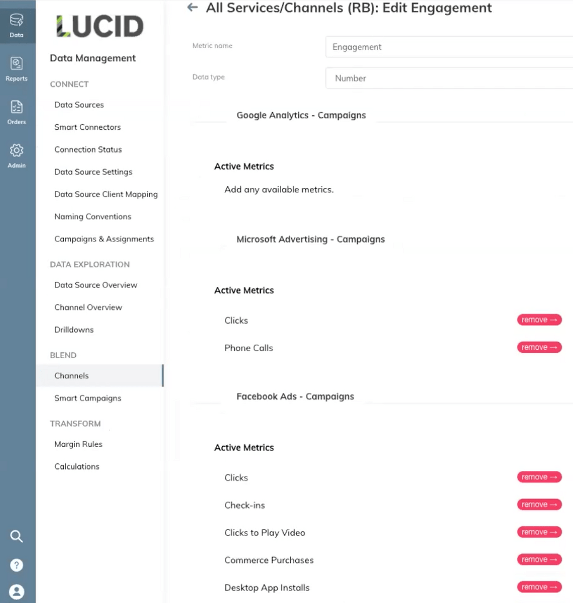
TapClicks solves this by letting you define custom metrics. You name the metric, choose which platform values to include, and set it up once. After that, TapClicks applies it across all dashboards and reports.
-
Combine values like clicks, phone calls, check-ins, and video plays
-
Create metrics like engagement, spend, or impressions that work across all channels
-
Apply these automatically in every campaign report
-
Skip manual exports, spreadsheets, and calculations
-
Pull from over 250 supported platforms or use Smart Connectors for others
Step 2: Build Visual Dashboards That Update Automatically
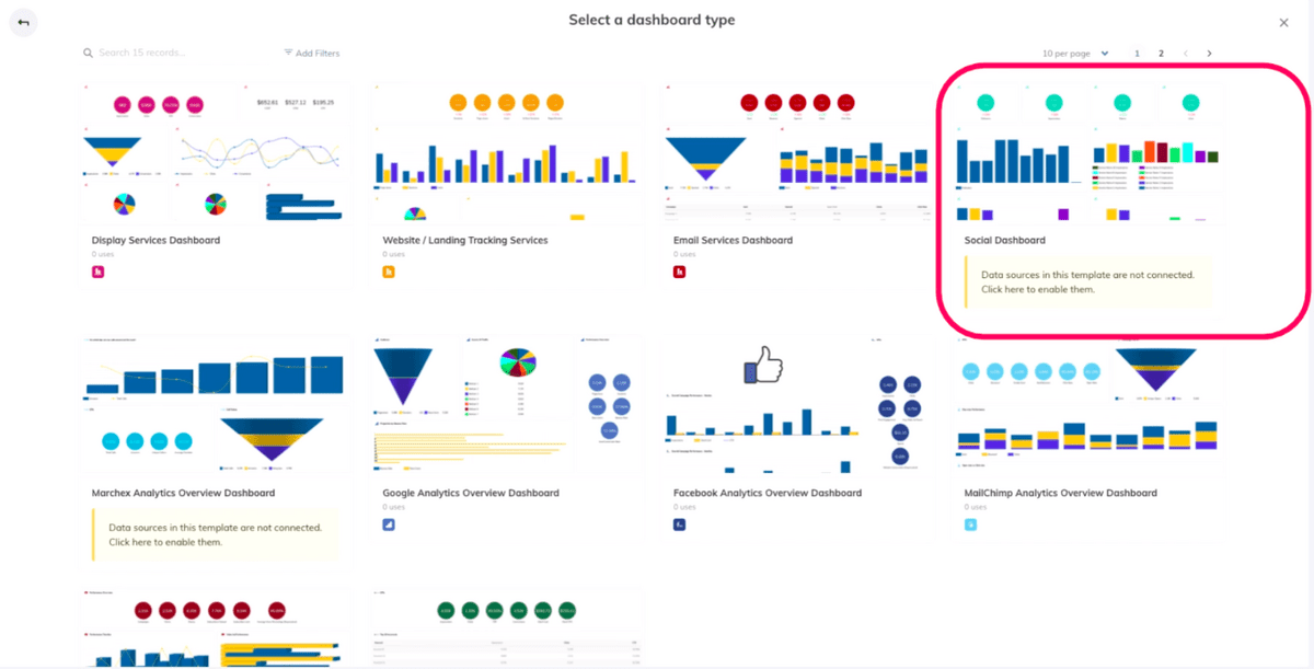
After setting up your metrics, you can create dashboards that show results clearly. TapClicks gives you flexibility in how you present data, with templates, custom visuals, and full control over layout and branding.
-
Start with a blank dashboard or use a template
-
Customize widgets by platform, metric, or ad group
-
Use graphs, tables, and charts to highlight results
-
White-label each report to match your client’s brand
-
Limit widget access so clients see only what they need
Once a dashboard is saved, you can reuse it across clients and update it anytime. If you manage 20 dashboards and need to add a new metric, just change the master template. TapClicks applies the update across all dashboards automatically.
TapClicks’ Report Studio: Automating Reporting for Presentations
Dashboards work well for live tracking, but many agencies still need to send slide decks to clients or execs. That usually means copying visuals into PowerPoint, updating data manually, and redoing the same steps every cycle.
TapClicks Report Studio removes those steps. It connects dashboards to presentation slides and builds export-ready reports with real-time data.
With Report Studio, you can:
-
Add updated graphs and metrics directly into slides
-
Pull campaign data from all connected platforms
-
Apply saved calculations like CTR or conversions
-
Use branded templates to match your client’s style
-
Schedule reports for automatic email delivery
Once built, these presentations run on autopilot. Reports stay current, formatted, and ready to send. No screenshots or last-minute edits.
TapClicks Ad Order Management and Project Management Solutions
TapClicks also includes tools to manage orders and workflows, so you don’t need extra software to track what happens before and after the report.
Included tools:
-
TapOrders - Handles campaign orders, approvals, and handoffs between sales and ops.
-
TapWorkflow - Tracks tasks, creative deadlines, and internal communication.
-
TapAnalytics- Centralizes all campaign data for real-time analysis and data-driven decisions.
If a handoff between design and SEO causes a delay, TapClicks shows where it happened and how it impacted performance. Teams stay accountable, and managers get full visibility across the process.
Try TapClicks for free for 14 days or book a demo now to learn more about the platform.
2. Tableau

Image Source: tableau.com
Tableau focuses on data visualization and helps teams build interactive dashboards that make large datasets easier to understand. It connects directly to common data sources, such as spreadsheets, SQL databases, cloud platforms, and APIs.
It includes several features that support fast, visual data analysis:
-
Customizable dashboards - Teams can build layouts that match their metrics, departments, or workflows.
-
Interactive dashboards - Users can filter by region, time period, or campaign to explore live data views.
-
Data integration - The platform pulls in metrics from different data sources, giving a full view of performance.
-
Data preparation tools - Tableau Prep helps users clean, combine, and reshape raw inputs before creating dashboards.
-
Real-time data - Dashboards update automatically when the data changes, helping teams track progress without delay.
-
Advanced features - Users can build calculated fields, run comparisons, and apply forecast models.
-
Data visualization tools - Charts, maps, and tables give teams visual options to represent their goals and results.
-
Detailed reports - Dashboards can be exported as PDFs or shared through secure links for clients or executives.
Pricing
Tableau’s pricing starts with the Enterprise Viewer plan at $35 per user per month. The Enterprise Explorer plan costs $70 per user per month. The Enterprise Creator plan is $115 per use per month.
All plans are billed annually.
3. Domo
Image Source: domo.com
Domo serves companies that need full access to real-time data across every department. It supports both business users and technical teams by combining data integration, automation, and visualization in one platform.
It includes features that support daily tracking and executive-level planning:
-
Real-time data - Dashboards update instantly when new data comes in from connected sources.
-
Custom dashboards - You can adjust views, colors, and metrics to fit their workflows.
-
Augmented analytics - The platform uses smart models to find patterns and predict outcomes.
-
Mobile access - Users can view dashboards and metrics on phones or tablets without losing functionality.
-
Data integration - Domo connects to hundreds of apps and systems, including CRMs, ERPs, and marketing tools.
-
Data transformation tools - Users can reshape data before it reaches the dashboard using drag-and-drop tools.
-
Data privacy controls - Teams can manage access levels by role, location, or department.
-
Collaboration - Built-in sharing tools let users comment, annotate, or assign tasks directly in dashboards.
Pricing
Domo doesn’t list its pricing publicly.
4. Looker Studio
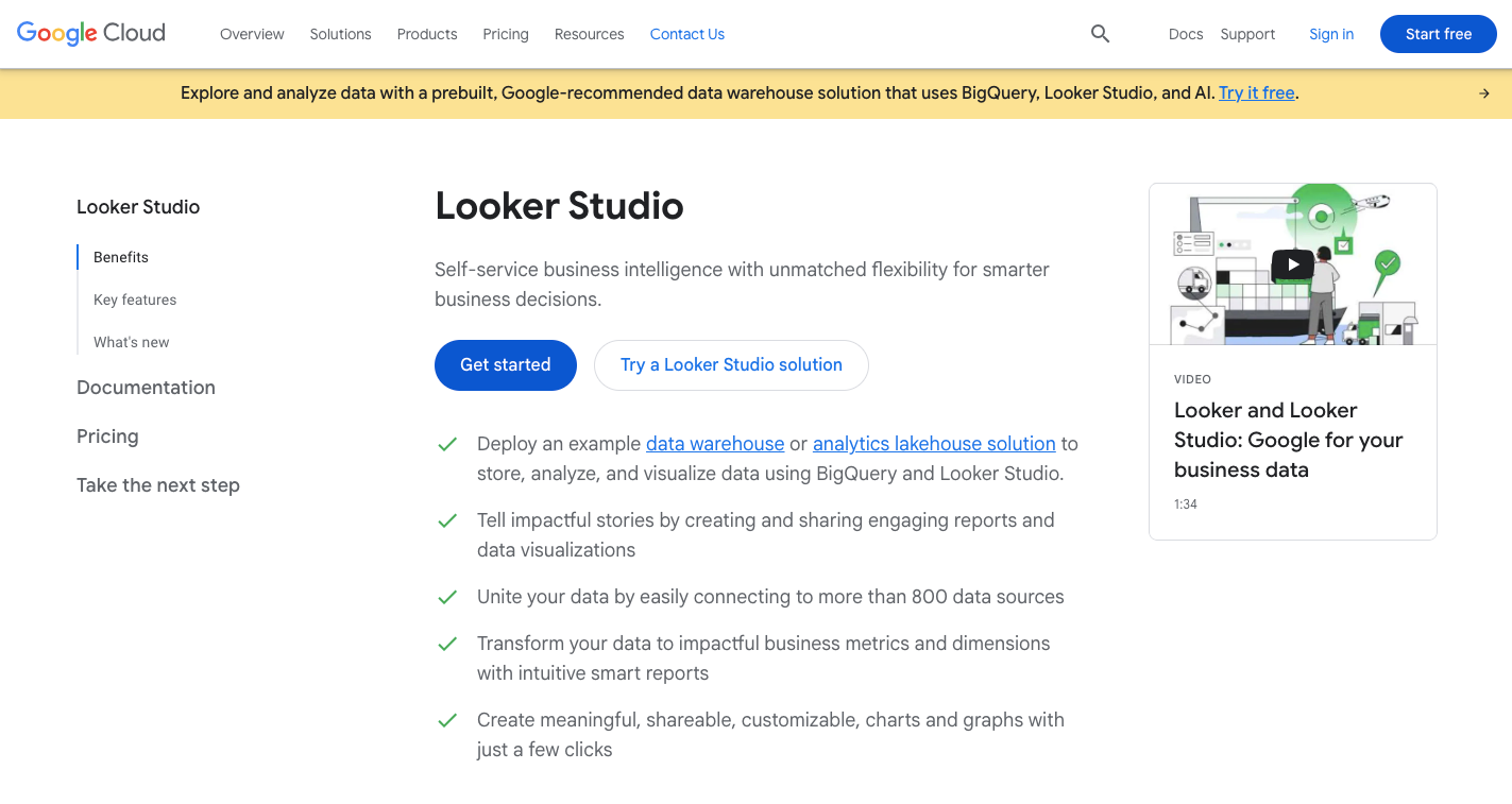
Image Source: cloud.google.com
Looker Studio, formerly Google Data Studio, gives teams a free and simple way to build dashboards. It suits marketers, analysts, and managers who need to create clean reports using real-time data pulled from everyday tools.
Key features include:
-
Web-based editor - Teams can log in from any browser and start building dashboards without installing software.
-
Report templates - The platform includes ready-made layouts that teams can adjust based on goals or branding.
-
Data connectors - Looker Studio links to tools like Google Ads, Sheets, BigQuery, and dozens of others.
-
Looker Studio API - Developers can manage assets, schedule refreshes, and move content across projects.
-
Report embedding - Users can publish reports on websites, intranets, or portals with live links.
-
Multiple data sources - Reports can combine inputs from various platforms to form a complete picture.
-
Workspace compatibility - The platform connects easily with other Google products like Analytics, Drive, and Gmail.
Pricing
Google doesn’t disclose prices for its three pricing tiers for Looker Studio.
5. Google Analytics
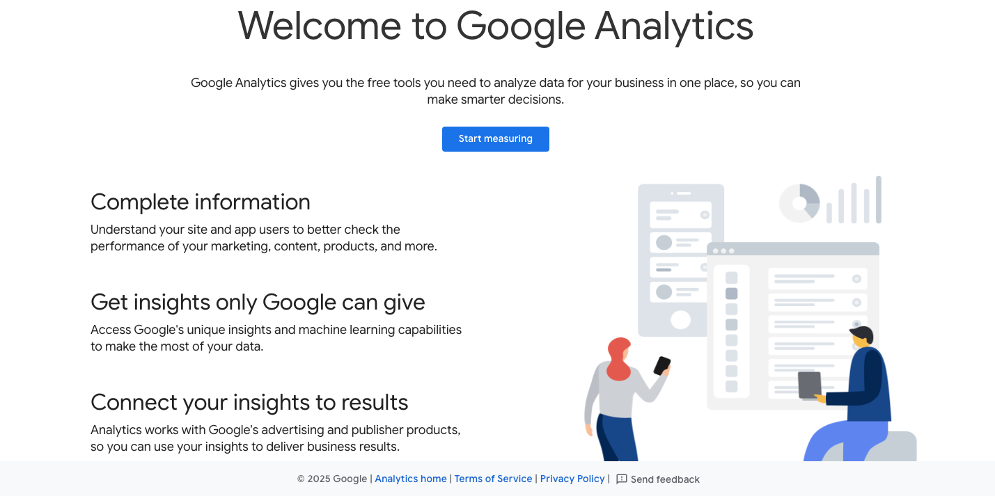
Image Source: analytics.google.com
Google Analytics helps businesses measure online performance by tracking user behavior, traffic patterns, and conversion paths. It supports both small websites and large enterprises that want detailed reporting from their digital properties.
The tool works well for teams who need to review marketing efforts, identify site issues, or measure campaign goals across platforms. Core features include:
-
Website tracking - Google Analytics captures visits, traffic sources, bounce rates, time on page, and user actions.
-
Data integration - Teams can link it with Google Ads, Search Console, and third-party tools to build complete reports.
-
Google Tag Manager support - You can set up custom tracking tags to collect specific actions or events.
-
Audience segmentation - The platform lets users break traffic into groups like new visitors, return users, or mobile traffic.
-
Event tracking - You can monitor clicks, downloads, video views, or form submissions in one place.
-
Conversion tracking - Teams can create goals and see which channels or campaigns drive the most results.
Pricing
Google Analytics offers a free plan for small to mid-sized websites. Google Analytics 360, the enterprise version, provides more data capacity and custom tools through a paid subscription.
6. Microsoft Power BI
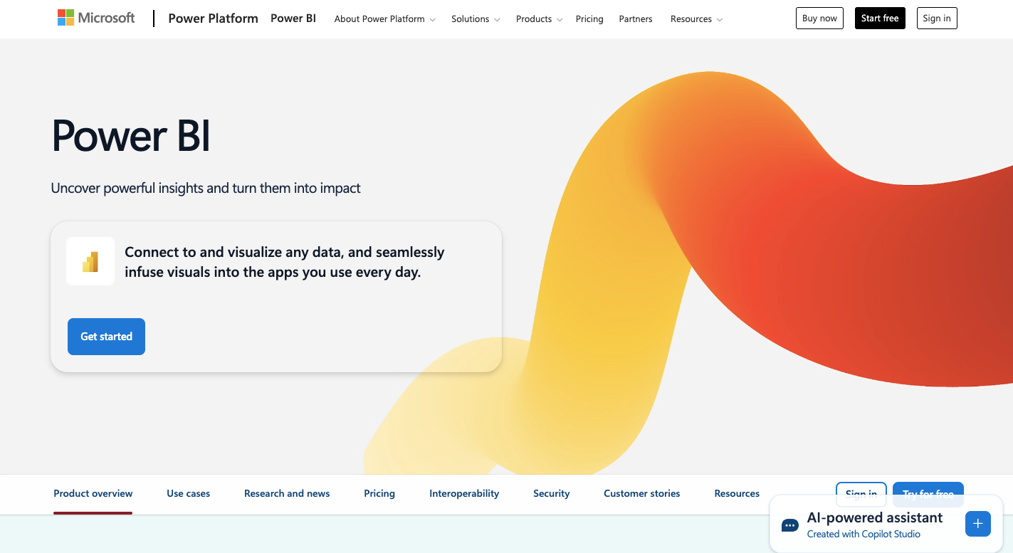
Image Source: microsoft.com
Power BI helps teams explore live data and track performance through interactive reports. It works well for companies that use Microsoft products. The tool supports:
-
Interactive charts and filters - Users can explore each data point, apply filters, and dig into what drives results.
-
Built-in data modeling - It links tables across systems and defines relationships to support deeper data analysis.
-
Change comparisons - Teams can compare performance over time and detect shifts in behavior or sales.
-
Copilot automation - The AI-powered assistant summarizes patterns, flags issues, and creates report drafts.
-
Microsoft 365 compatibility - The platform connects easily with Excel, Azure, SharePoint, and other tools.
-
Data connectors - It supports access to SQL databases, cloud platforms, Google Analytics, and more.
-
Flexible sharing - Reports and dashboards can be shared through the cloud, embedded in apps, or downloaded.
Pricing
Power BI has a free version for personal use. Power BI Pro costs $14 per user per month. Power BI Premium Per User is $24 per user per month. The paid plans are billed annually.
How to Get the Most From Automated Reporting Tools and Dashboards
To gain the full benefit of automated reporting software and your dashboards and reports, apply the following strategies. These steps help reduce manual marketing reporting, improve customer data accuracy, and support better decisions based on deeper insights.
-
Set clear goals first - Define what metrics matter most to your team before setting up a reporting tool. It avoids cluttered dashboards and helps you focus on the right data.
-
Centralize your data sources - Combine inputs from files, platforms, and campaigns. Tools with strong data integration keep your reporting system clean and reliable.
-
Use templates and scheduling features - Save time by using prebuilt formats and scheduling your report exports. It reduces manual reporting tasks and keeps stakeholders informed.
-
Build role-specific views - Create different customizable dashboards for marketing, sales, or operations.
-
Automate filters and alerts - Add triggers or filters to flag performance drops, high spend, or broken links so you don’t need to check manually.
-
Regularly review and improve reports - Set a monthly review schedule to tweak visuals, improve layouts, or add advanced features.
-
Train your team - Teach users how to adjust filters, export reports, and track goals. A user-friendly interface helps, but guidance still matters.
-
Track usage and feedback - See which reports get used and which don’t. Use feedback to cut noise and build better layouts.
Create a Comprehensive Report Client-Ready With TapClicks
While many business intelligence and reporting tools offer automated reporting, TapClicks excels in scalability.
It provides more data integrations with marketing platforms, a customizable Report Studio, and unlimited accounts per client for campaign updates.
TapClicks also integrates order management, project tracking, analytics, and reporting into one platform, which eliminates the need for third-party software. Businesses seeking an accurate data reporting solution can start with a free trial to experience its full capabilities.
Automate dashboards, unify data, and drive results with less effort. Try TapClicks free for 14 days!
FAQs About Automated Reporting Tools
What are automated reporting tools?
Automated reporting tools are software platforms that collect, organize, and deliver performance data without manual work. They help businesses monitor metrics, improve data quality, and produce reports with up-to-date information. These tools support report automation, reduce errors, and make it easier to gain actionable insights from marketing, sales, or financial data.
What is the best tool for reporting?
The best tool depends on your needs, but platforms like TapClicks offer a comprehensive solution for agencies and enterprises. It handles data analytics, operational reporting, automating data collection, and integrates with tools like Google Sheets to simplify workflows and easily transform raw data.
Is Excel a reporting tool?
Yes, Excel can function as a basic reporting tool. However, it lacks built-in report automation and real-time integrations, making it harder to scale or maintain data quality in complex environments.
How to automate daily reporting?
To automate daily reporting, use a platform like TapClicks or another modern tool that connects to your data sources, applies calculations, and sends updates automatically. These systems streamline automating data collection, update dashboards in real time, and eliminate the need to manually refresh Excel or Google Sheets files.