
Top 5 Tableau Competitors for Better Analysis in 2025
For some teams, Tableau performs well, but many face limitations. Business users often need faster reports, easier sharing, exceptional customer support, and tools that don’t require technical expertise. Some teams also depend on third-party tools that don’t connect smoothly with Tableau.
The good news is, you’ve got options.
Several data analytics tools now offer clean dashboards, real-time tracking, and smoother ways to share data insights. These platforms support data-driven decision making without a steep learning curve.
In this guide, we’ll walk through five Tableau competitors that help you handle large datasets, build reports faster, and work smarter across your team.
What Is Tableau?
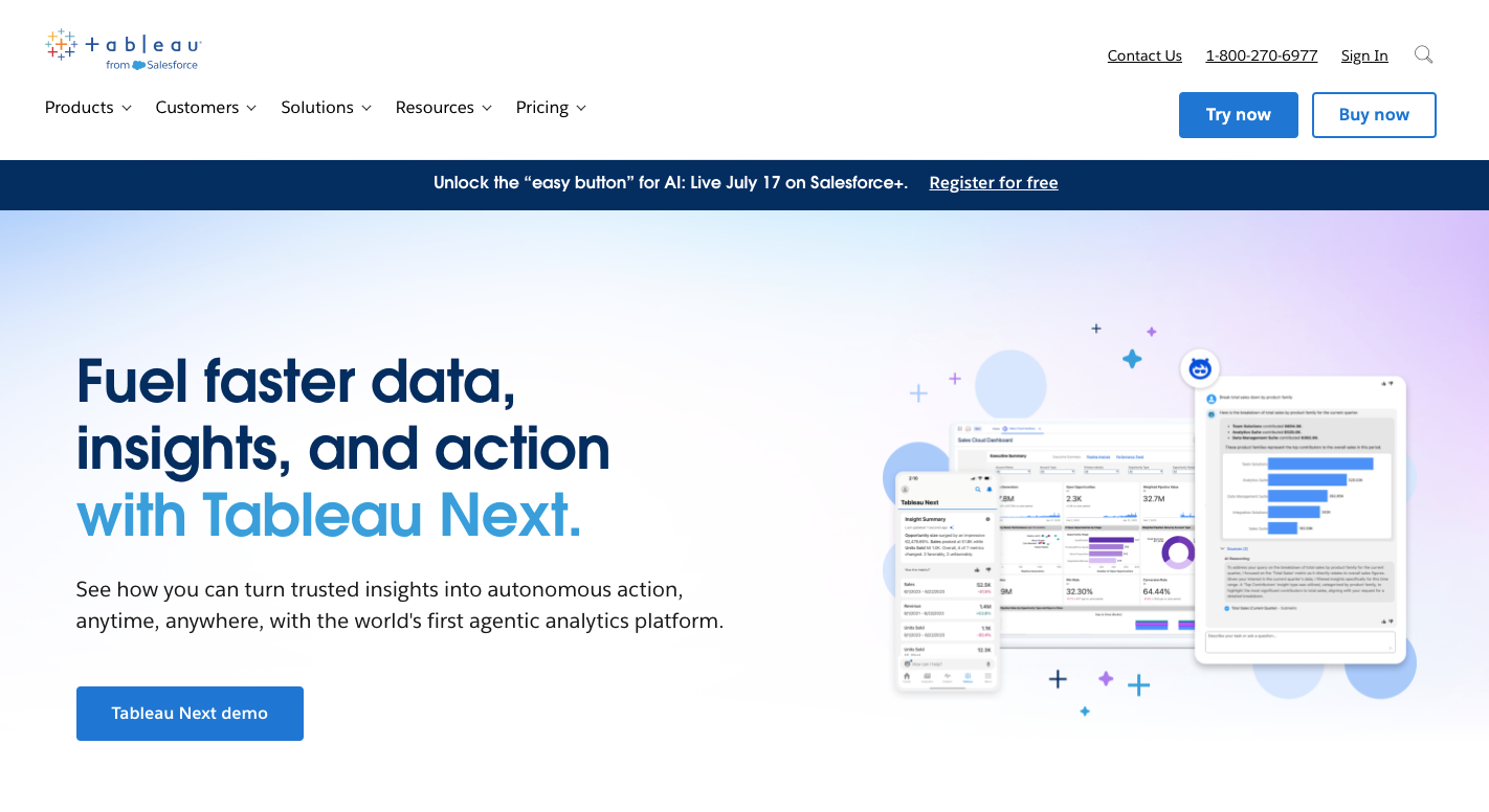
Image Source: tableau.com
Tableau is a recognized data analytics platform in the business intelligence space. It gives you a way to organize, clean, and visualize data without relying heavily on code.
Salesforce acquired Tableau in 2019, and the tool integrates effortlessly with Salesforce CRM, Salesforce CDP, and other tools within the ecosystem. It supports cloud data, Tableau Server for private hosting, and includes embedded analytics for dashboards inside external platforms.
Many business users appreciate how easy it is to build interactive dashboards with its drag-and-drop system. However, it’s not the easiest tool to learn once you move past the basics. Advanced capabilities like predictive analytics or scripting often require extra training or IT support.
Some teams also find that it lacks built-in version control or adjustable scheduling. These gaps can lead to delays when you rely on quick updates and collaboration.
Key Features
Tableau includes a range of features that support data visualization, reporting, and advanced analytics, such as:
-
Real-time reporting - Supports real-time data analysis when connected to live data sources.
-
Predictive analytics - Allows forecasting and trend analysis through built-in models.
-
Use of multiple data sources - Combines structured and unstructured data across spreadsheets, databases, and cloud services.
-
Natural language queries - Enables users to ask data-related questions using plain language.
-
Embedded analytics - Includes embedded analytics for showing reports inside apps or client portals.
-
Cloud data support - Works with major cloud platforms for hosted or hybrid deployment.
-
Analytics capabilities - Supports geospatial analysis, calculated fields, and statistical modeling.
Pricing
Tableau offers three main user roles: Viewer at $15 per user per month, Explorer at $42 per user per month, and Creator at $75 per user per month. For enterprise environments, plans go higher: $35 per user per month for Enterprise Viewer, $70 per user per month for Enterprise Explorer, and $115 per user per month for Enterprise Creator.
All plans are billed annually.
Why Are Business Users Looking for an Alternative to Tableau?
As your reporting needs grow, you might notice certain parts of the platform slowing you down. For instance, it:
-
Struggles with performance when handling large datasets.
-
Has a steep learning curve that blocks non-technical users from working independently.
-
Acts only as a visualization tool and lacks support for complete analytics workflows.
-
Limits data preparation, forcing users to rely on outside tools for cleaning or shaping data.
-
Doesn’t offer built-in scheduling for automatic report updates.
-
Uses static parameters that don’t adjust as data changes.
-
Lacks version control, which makes it hard to track changes across reports.
-
Pushes teams to switch to other BI tools to get work done faster.
-
Performs poorly when faced with increasing data volumes.
-
Lacks advanced modeling options that many data scientists rely on.
-
Doesn’t include automated report delivery as a core feature.
-
Requires SQL knowledge to connect certain third-party systems.
5 Tableau Alternatives You Should Explore for Better Data Analysis
These five tools offer fresh ways to analyze data and build reports:
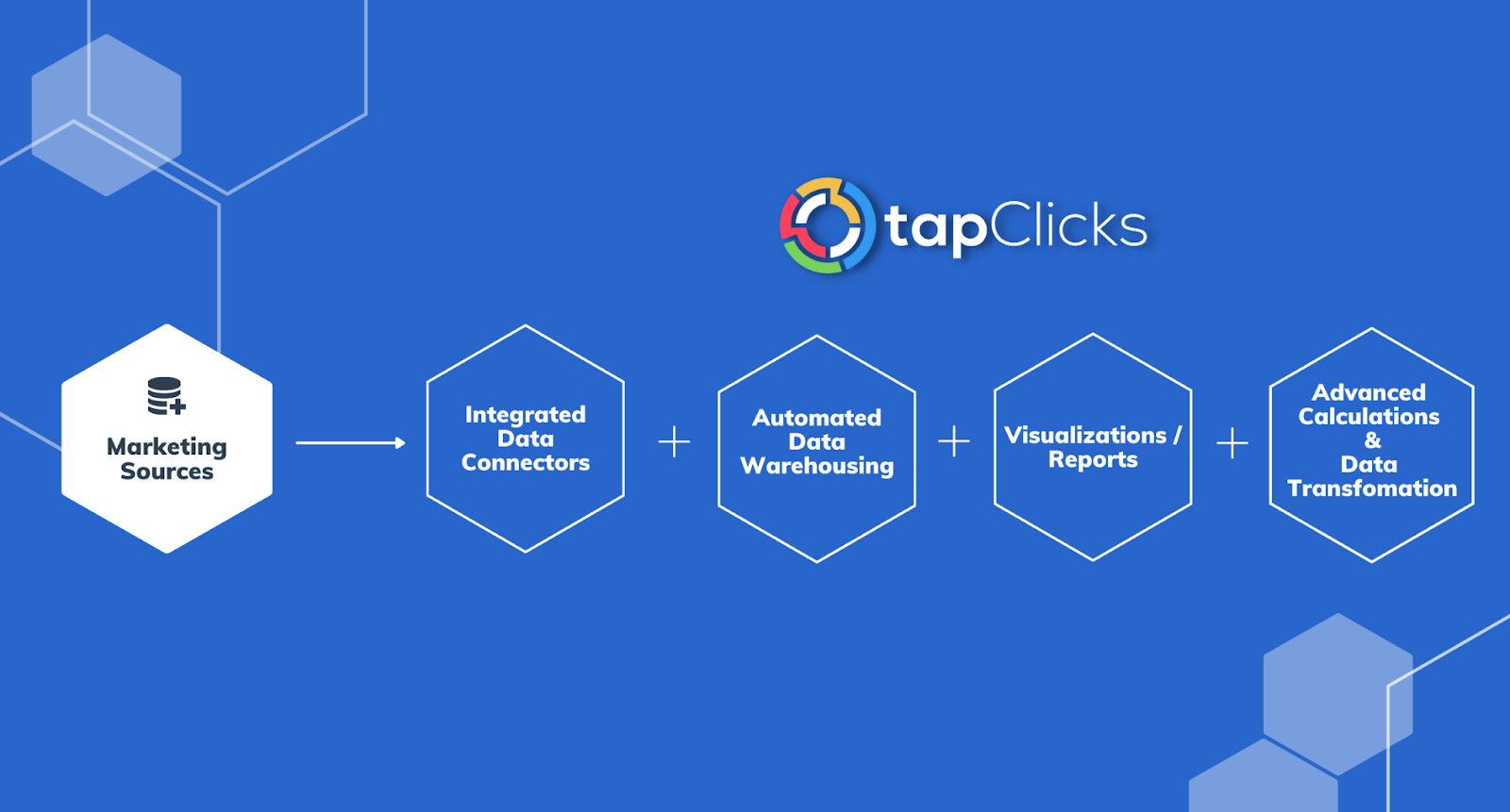
1. TapClicks
Trying to pull marketing data from every platform, clean it up, and send reports manually? That’s time you never get back.
TapClicks changes that. The platform handles everything from data collection to final client-ready reports, so you can focus on improving performance.
Below are five features of TapClicks that help you save time and actually enjoy reporting again.
Pull From Thousands of Marketing Data Sources
You don’t have to use multiple tools just to connect with the platforms you use.
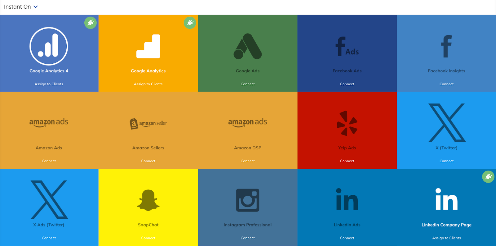
TapClicks supports over 250 direct integrations, including Google Ads, Facebook, WideOrbit, Salesforce, Amazon Ads, and Snowflake. It also includes a Smart Connector tool to set up feeds from platforms without built-in integrations.
Data refreshes automatically every day or anytime you choose. You don’t need your data team to manage API issues either. TapClicks handles that for you.
Store and Access All Your Data in One Place
Other tools give you real-time dashboards, but they don’t store your data unless you set up a separate data warehouse. TapClicks includes a fully managed data warehouse that’s always on. You don’t need SQL skills or IT support to access it.
Everything you pull in is stored permanently, so you can run year-over-year comparisons or deep-dive into past campaign performance without scrambling for backups or scraping expired reports.
Automate Complex Calculations Once and Reuse Them Everywhere
TapClicks lets you define and reuse custom metrics across any dashboard or report. For example, you can group different campaign types under a single product name or calculate click-through rates across dozens of ad sets without writing formulas every time.
Once your logic is defined, it works everywhere. There’s no need to rebuild it for each client or reporting cycle.
Use Dashboards That Scale Across Every Client
Need to update all your clients’ dashboards with a new metric? You don’t have to do it one by one. TapClicks uses dashboard templates, so you can push updates across hundreds of dashboards at once. You can still customize for specific clients, but you’ll never have to repeat the same work over and over.
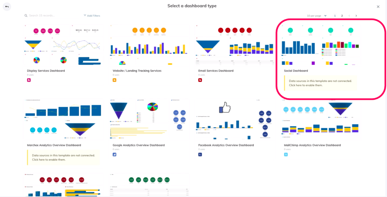
Each dashboard is fully white-labeled and permission-controlled. That means clients only see what you want them to see, and your internal team stays in full control.
Build and Send Polished Reports Automatically
Forget pasting screenshots into PowerPoint. TapClicks ReportStudio pulls your live data into branded, presentation-ready reports that look exactly how you want. You can build them once and let them run on autopilot.
Choose your format, pick a schedule, and decide who gets what. Your reports go out automatically with the recent data and no manual work.
2. Looker Studio
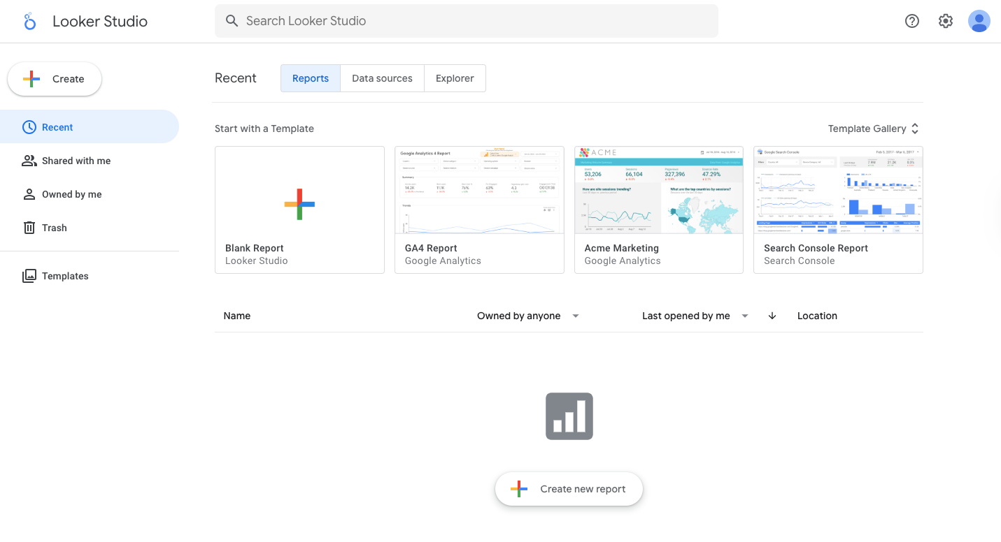
Image Source: lookerstudio.google.com
As a self-service BI tool, Looker Studio (formerly Google Data Studio) gives you everything you need to pull data from multiple sources and build dashboards without relying on developers or data engineers.
The platform runs entirely in your browser, so there’s nothing to install or maintain. You can even build reports fast, apply real-time filters, and share your work without needing advanced skills.
When your reports use heavy queries or large datasets, you’ll notice that the performance slows down. Other than that, the customization options are more limited, and you won’t find advanced scripting or machine learning features here.
Some users, however, find Looker’s customer support to be much more responsive than Tableau’s.
Key Features
Looker Studio offers the basics your team needs to create live dashboards, explore trends, and share reports easily:
-
Data connectors – Link spreadsheets, Google products, SQL databases, and partner platforms in one place.
-
Customizable dashboard – Add filters, drill-downs, and real-time updates that fit your workflow.
-
Real-time collaboration – Edit reports with teammates at the same time, without versioning issues.
-
Sharing controls – Manage view and edit access with user-based permissions.
-
Drag-and-drop builder – Place and arrange charts, tables, and visuals without writing code.
-
Templates library – Start faster with layouts designed for traffic reports, campaign performance, and more.
-
Security settings – Prioritize data security through encryption, access controls, and data governance features.
-
Brand customization – Match colors, fonts, and logos to your organization’s style.
-
Embedded reports – Publish interactive dashboards to internal portals, websites, or client hubs.
Pricing
Looker Studio is free for anyone with a Google account. You can connect your data, create reports, and share them without paying anything.
For teams that need admin tools, audit logs, or support, Looker Studio Pro starts at $9 per user per project each month. The Pro version also has access to enterprise features and stronger integration with Google Cloud.
3. Qlik
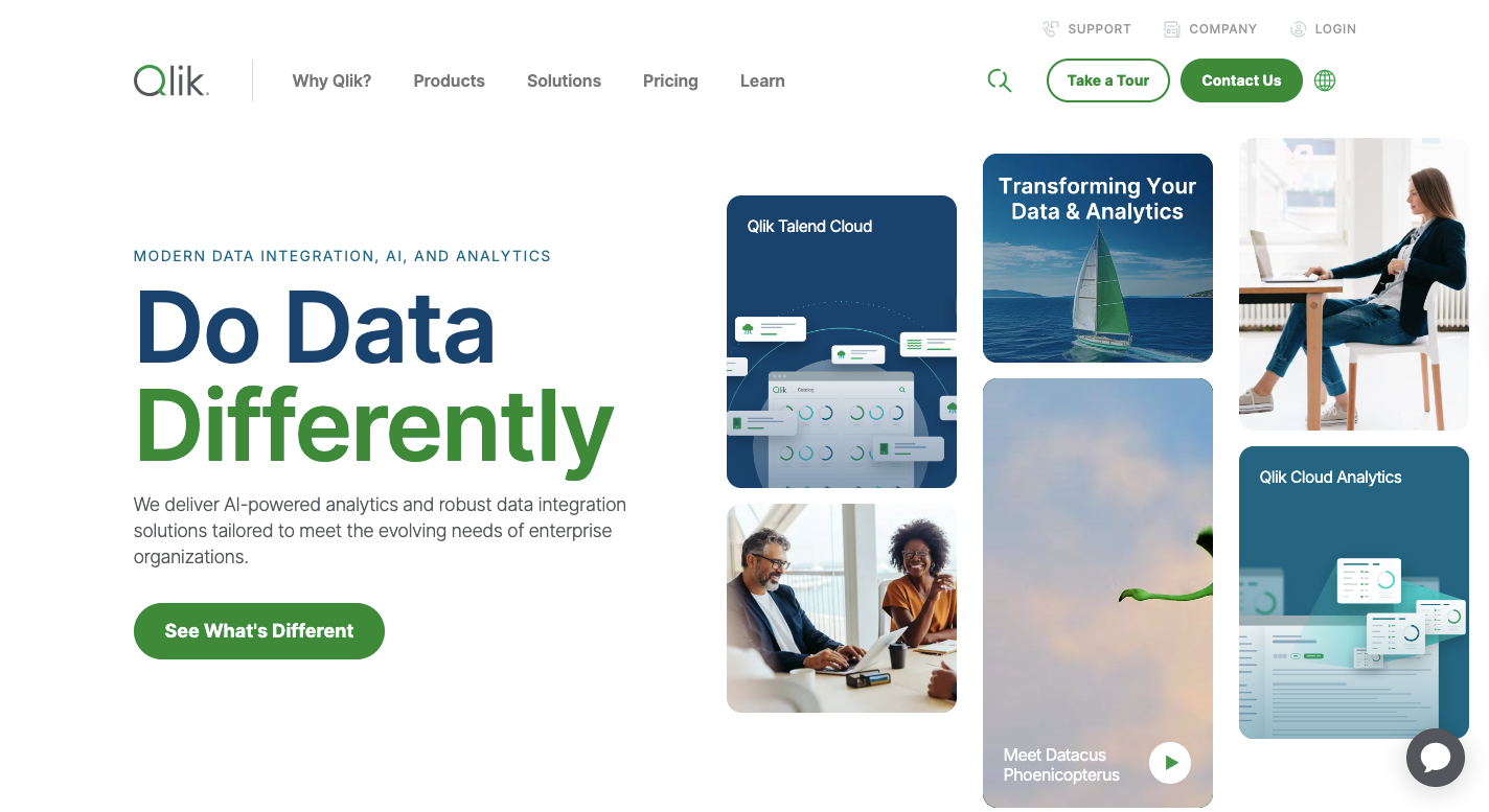
Image Source: qlik.com
Unlike Tableau, which often expects you to know what you’re looking for upfront, Qlik lets you explore data interactively without the constraints of predefined data paths. It lets you click around and find patterns on your own.
The platform handles complex data and gives you space to ask better questions without needing to write new queries every time. You’ll also notice Qlik supports natural language queries, predictive analytics, and automated report delivery without needing plugins or third-party tools.
While it may take a little time to get used to the layout, the intuitive user interface has improved a lot. If you work with dynamic data and want something smarter than just dashboards, Qlik does the job.
Key Features
Qlik is packed with features that help you understand your data, automate your reports, and move faster between questions and answers:
-
Associative engine – Lets you explore without being locked into preset filters or queries.
-
Self-service data prep – Gives you tools to clean and load your data without coding.
-
Interactive visualizations – Respond instantly to filters, selections, and inputs.
-
Data storytelling – Turns charts into narratives that guide people through the insights.
-
AI-powered analysis – Supports predictive analytics, natural language queries, and auto-generated insights.
-
Role-based permissions – Controls access at every level of your organization.
-
Embedded analytics – Inserts reports into portals, apps, and external sites.
-
Workflow automation – Sends alerts, refreshes data, and schedules reports without manual work.
-
Data extraction and lineage – Pulls from systems like SAP and traces every step along the way.
Pricing
Qlik’s Starter plan starts at $200 per month, which covers 10 users and 25 GB of data.
The Standard plan at $825 per month adds more automation, collaboration features, and larger capacity. Premium plans start at $2,750 per month and include public sharing, advanced data extraction, and onboarding support.
All plans are billed annually.
4. Domo
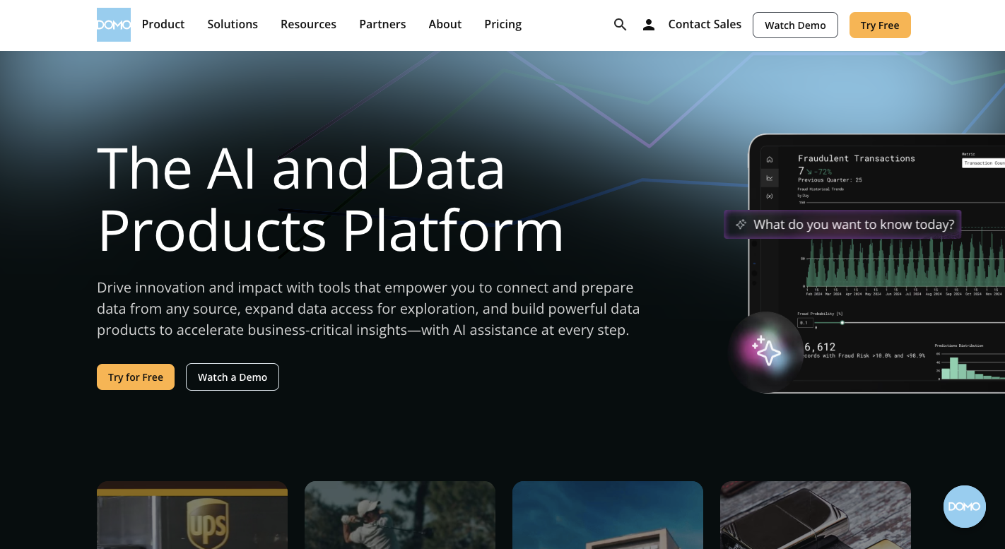
Image Source: domo.com
Need something faster and more collaborative than Tableau? Domo could be a better fit. It works well when your team needs to connect data from everywhere, build reports quickly, and stay on top of real-time updates.
Anyone working with large volumes of raw data will appreciate how Domo handles data integration. Over 1,000 connectors are ready to pull in information from apps, databases, and platforms.
The system transforms raw data into useful insights, even without heavy technical expertise. You don’t have to be a data scientist to get real value out of the platform. It further supports real-time data analysis and makes sharing insights easier across teams.
With the intuitive interface, you can also move faster and spend less time waiting for analysts.
Key Features
Domo includes several useful features to help you explore data:
-
AI-powered workflows - Get suggestions and detect unusual trends using built-in machine learning.
-
Data apps and workflows - Automate reporting or build full internal tools using low-code and pro-code.
-
Custom branding - Change colors, logos, and layouts to match your company’s identity.
-
Personalized access - Share insights based on role or department without duplicating work.
-
Scheduled reporting - Set up automated report delivery to your inbox or Slack channels.
-
Collaboration tools - Leave comments, track updates, and work together right inside the dashboard.
-
Active user community - Get help, feedback, and advice from people using Domo every day.
Pricing
Domo offers a free 30-day plan with full platform access, unlimited users, onboarding assistance, and one live training session.
The Paid plan includes everything from the free tier, plus support for HIPAA compliance, custom connectors, AWS PrivateLink, and advanced support options. However, Domo doesn’t disclose the pricing publicly.
5. Power BI
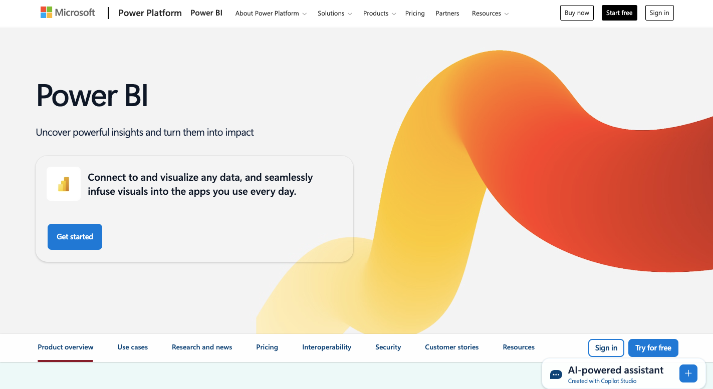
Image Source: microsoft.com
Unlike Tableau, which leans into advanced visual storytelling, Power BI focuses on analytics and collaboration. It gives you data management, real-time capabilities, and scalable performance without heavy reliance on technical expertise.
When you’re already working in Microsoft’s ecosystem, the transition to Power BI feels almost natural. The drag-and-drop interface simplifies dashboard creation, even when you’re using multiple data sources or complex models.
For anyone handling raw data, the platform makes it easier to shape and transform information into actionable insights. Ad hoc analysis, AI features, and built-in report sharing further help your team move faster. You’ll also get integration capabilities that extend beyond Microsoft.
Key Features
Power BI comes with features that support data-driven work across skill levels:
-
Data connectivity - Access files, databases, APIs, and cloud apps from a growing list of supported sources.
-
Drag-and-drop dashboard builder - Create interactive visualizations and layout reports with minimal effort.
-
AI-powered analytics - Enable predictive analytics and generate insights through natural language queries.
-
Ad hoc analysis - Run quick, flexible explorations without needing predefined queries.
-
Security and access control - Apply row-level permissions and manage sensitive data access with confidence.
-
Excel and Teams seamless integration - Push data between apps and embed dashboards into Microsoft Teams.
-
Extensive documentation - Dive into tutorials, examples, and guides from Microsoft’s learning center.
-
Active user community - Learn from peers, share tips, and get quick answers through forums and support groups.
Pricing
Power BI offers a free version that covers basic data analysis needs. Power BI Pro unlocks sharing, collaboration, and publishing features at $14 per user per month.
For more advanced workloads, Premium Per User adds capacity, enhanced performance, and larger data models for $24 per month. Enterprise plans tied to Microsoft Fabric exist but require custom quotes based on your needs.
Paid plans are available only via an annual subscription.
Go Beyond the Limits of Tableau With TapClicks

Tableau lets you build impressive dashboards, but it doesn’t handle the full analytics workflow. You’re still stuck cleaning data manually, hopping between tools, and building the same reports every month. That slows you down and pulls you away from strategy. TapClicks changes that.
Here’s how TapClicks helps you move faster:
-
Connects to over 6,000 data sources with pre-built and custom connectors.
-
Stores all your marketing data automatically in a managed warehouse.
-
Applies your formulas and metrics across all campaigns without extra setup.
-
Updates dashboards and reports automatically with live data.
-
Lets you manage hundreds of clients with one dashboard template.
-
Sends white-labeled, PowerPoint-style reports on your schedule.
-
Removes the need for separate ETL, spreadsheet tools, or manual work.
-
Keeps your reporting smooth even with traditional, complex, or offline data.
Tired of Tableau’s complexity? Book a demo with TapClicks and make marketing analytics simple!
FAQs About Tableau Competitors
Who is the competitor of Tableau?
TapClicks is a major competitor, especially for marketing teams. It automates reporting, supports large-scale client dashboards, and handles data exploration more efficiently than Tableau.
What is similar to Tableau?
Power BI, Qlik, Looker Studio, and Domo offer similar dashboarding and business intelligence features, but each differs in data integration, pricing, and ease of use.
What is Google’s equivalent to Tableau?
Looker Studio (formerly Google Data Studio) is Google’s equivalent to Tableau. It supports data visualization, connects to Google tools, and helps with flexible, cloud-based dashboarding.
Is Tableau a CRM or ERP?
No. Tableau is a business intelligence platform, not a CRM or ERP.
Which analytics platform offers better data visualization capabilities?
TapClicks offers better modern data visualization capabilities for marketers than Tableau, especially when you need white-labeled reports, centralized dashboards across hundreds of clients, and custom metrics that update automatically.