
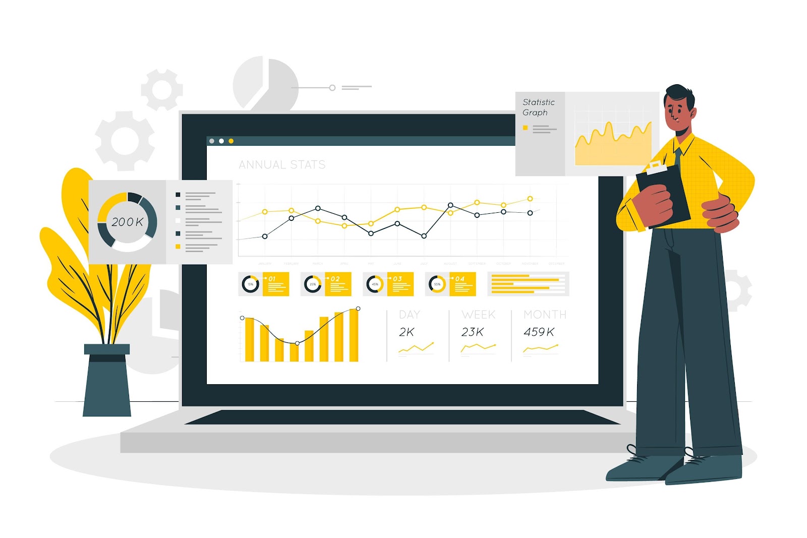
How to Build an Analytics Dashboard to Monitor Key Metrics
To build an analytics dashboard that tracks key metrics, you need three things: a clear goal, access to the right data, and a tool that helps you turn numbers into visuals.
The process starts with knowing what you want to measure. From there, you connect your data sources, choose how to display your numbers, and set up a dashboard that updates automatically.
In this article, you’ll learn exactly how to build an analytics dashboard step by step. You’ll also see examples of dashboards and metrics you can use to monitor performance and make smarter decisions.
Simplify dashboard reporting and keep every client on the same page. Book a demo with TapClicks!
Why Use Analytics Dashboards?
Analytics dashboards organize data into clear, visual displays that support fast decision making. Teams no longer waste time hunting through spreadsheets or juggling disconnected reports. With real-time updates, each user sees exactly what’s happening as it happens.
The right dashboard helps users present data in ways that are easy to understand. Interactive charts, such as line graphs or bar charts, reveal patterns, shifts, and outliers without confusion.
Senior management executives use them to stay updated on overall performance, while marketing teams rely on them to track campaign progress and adjust quickly.
Some analytics dashboard examples include:
-
Website analytics dashboard - Tracks website traffic, bounce rate, and engagement.
-
Data analytics dashboard - Combines relevant data from multiple sources.
-
Product analytics dashboard - Shows how active users engage with features.
-
Social media dashboard - Measures clicks, impressions, and campaign performance.
-
SEO analytics dashboard - Follows keyword rankings and supports a stronger SEO strategy.
A web analytics dashboard brings raw data together to uncover meaningful insights. Search engines change often, and trends shift fast. A clear dashboard keeps teams focused, supports data-driven decision making, and helps everyone stay on the same page without delays.
How to Build an Analytics Dashboard
To build a new dashboard, you need a clear plan. Start by setting your goal, then choose the data, pick a tool, and design the layout. The steps below walk you through the full process.
1. Define the Goal of Your Analytics Dashboard
Before building a dashboard, establish a clear objective. Determine what you aim to measure and who will use the information. For instance, a marketing team might focus on tracking conversion rates, while a product team could monitor feature usage.
Understanding the goal helps in selecting relevant metrics and sources. For example, if the objective is to enhance customer retention, focusing on customer lifetime value (CLV) is essential.
In 2024, average CLV varies significantly across industries, with architecture firms at $1.13 million and software companies at $240,000.
Aligning the dashboard’s purpose with business objectives makes sure it provides actionable insights. A well-defined goal also aids in creating a user interface that caters to the needs of its users.
2. Identify Key Metrics to Monitor Campaign Performance
For marketing campaigns, include important metrics such as click-through rates, bounce rates, and conversion rates.
According to PPC.io, average conversion rates vary by industry, with B2B services at 3.5% and agencies at 6.05%.
Choosing the right metrics ensures that the dashboard provides meaningful insights. For instance, a digital marketing team might focus on metrics like cost per acquisition and return on ad spend.
An SEO dashboard would track keyword rankings and organic traffic growth.
Try to avoid swamping the dashboard with too many metrics. Instead, focus on those that directly impact the campaign’s success.
By selecting specific metrics, the dashboard becomes an effective tool for monitoring campaign performance and driving improvements.
3. Choose Your Data Sources
Identifying the right sources is essential for building an effective dashboard. These sources provide the raw data needed to calculate and display your selected metrics.
Common data sources include CRM systems, email marketing platforms, and web analytics tools like Google Analytics.
For example, Google Analytics offers insights into website traffic, user behavior, and conversion paths. Integrating data from various platforms ensures a comprehensive view of performance. However, it’s important to ensure data consistency and accuracy across sources.
When selecting sources, consider the frequency of data updates and the relevance to your defined metrics. Timely and accurate data enables real-time monitoring and swift decision-making.
4. Pick the Right Dashboard or Analytics Platform
The platform you select should offer a user-friendly interface and support the integration of your chosen sources.
When choosing a platform, consider its ability to present data through various visualization options, such as column charts, line graphs, and pie charts. These visualizations aid in identifying trends and patterns, which facilitates data-driven decision-making.
Additionally, assess the platform’s capability to handle real-time data updates and its compatibility with your existing systems.
An effective platform should empower digital marketers and analysts to customize dashboards according to their specific needs.
5. Customize Dashboard Layout and Structure
A clean layout helps users spot changes fast. Choose visuals that match the type of data shown. Use line charts to track progress over time. Use a tree map to break down groups, such as product categories or regions.
Group related metrics side by side. If the dashboard compares regional sales revenue, show each region in the same section. Let users interact with filters, drop-downs, or time ranges. These features allow a closer look at what matters.
Use consistent labels and spacing across sections. Good formatting keeps confusion out and helps everyone read the data quickly.
When teams customize dashboards for different roles, people only see what they need. Marketing executives may only want top-level results. Analysts might dig into the full dataset.
Customizable dashboards also improve focus. Use color and size to guide attention. Add context with footnotes, icons, or simple callouts. Help users understand what changed and why it matters.
The right layout gets used more often. It saves time, removes clutter, and gives users a dashboard that fits how they think.
6. Connect the Relevant Data and Build Dashboards
Start with a full list of platforms used by your team. Connect data from sales, marketing, product, and support tools.
Pulling numbers from all key sources helps give a complete view of performance. The dashboard should reflect all the data shown in other internal systems.
Connect each source carefully. Confirm that data fields match what the dashboard needs to display. Numbers must add up across platforms. Mismatches cause confusion and slow down reporting.
Sales teams often want dashboards focused on revenue, pipeline, or close rate. Product teams may track engagement, retention, and feature use.
Marketing teams often focus on leads, spend, and campaign results. Allowing users to explore data through filters makes the dashboard more flexible.
The best platforms support real-time sync, easy connections, and role-based views. With these tools, teams can create dashboards faster and more accurately. Each source feeds directly into the final output.
Avoid manual exports and copy-paste. Automate where possible. A reliable connection helps update numbers on time. Clean and verified data improves confidence in the final result and supports fast, informed choices across teams.
7. Customize and Visualize Your Key Metrics
Each team views metrics differently. Customize the dashboard to match those needs. Display the correct numbers in the proper format for each user. Add only what helps drive action.
Use line charts for time-based trends like user growth or monthly spend. Choose visuals that fit the metric.
A stacked bar can break down totals by category. A pie chart works well for showing the share. A tree map makes sense when showing parts of a bigger system.
Marketing executives care about campaign spend and ROI. Product managers track new users and feature use. Show those metrics clearly and without extra noise. Highlight changes that need action. Make it easy to spot wins and problems.
Let users interact with the charts. Clicking a section to drill down helps find what caused a spike or drop. Data displayed should match real-world changes.
Each section should support a goal. Avoid dashboards filled with numbers nobody uses. Focus only on the most useful pieces.
Strong design and smart visual choices help every team stay focused, move faster, and spot what needs to change.
8. Automate Reporting and Data Refresh
Reports work best when they stay up to date. Automate the dashboard to pull fresh data on a schedule. Set hourly, daily, or weekly refresh depending on how fast things move. Updated data supports faster choices.
Create automated emails with summary reports. Send updates to decision-makers on a regular schedule. Share numbers early before small problems grow. Use automation to reach more people without extra work.
Give teams the ability to control what they see. Let users create alerts when numbers move outside a range. Build in quick ways to share results with others. One-click export or shared links help cut down on meetings.
Dashboards work best when they run themselves. A strong system avoids delays. Digital teams don’t want to chase down reports. Build smart rules and let the system do the rest.
Look at how the best analytics platforms handle refresh and delivery. Most tools offer ways to keep dashboards active. Fewer manual steps mean fewer mistakes.
Automation turns the dashboard from a static report into a real-time source of action. The faster teams see the truth, the faster they can respond.
3 Ways TapClicks Transform How You Report and Visualize Data
Building an analytics dashboard is only the first step. Keeping it updated, easy to read, and ready to share takes more work. TapClicks helps solve these problems by simplifying how teams connect data, build visuals, and share reports.
The steps below show how it improves both speed and clarity without adding more tools or extra steps.
Connect Your Data Sources
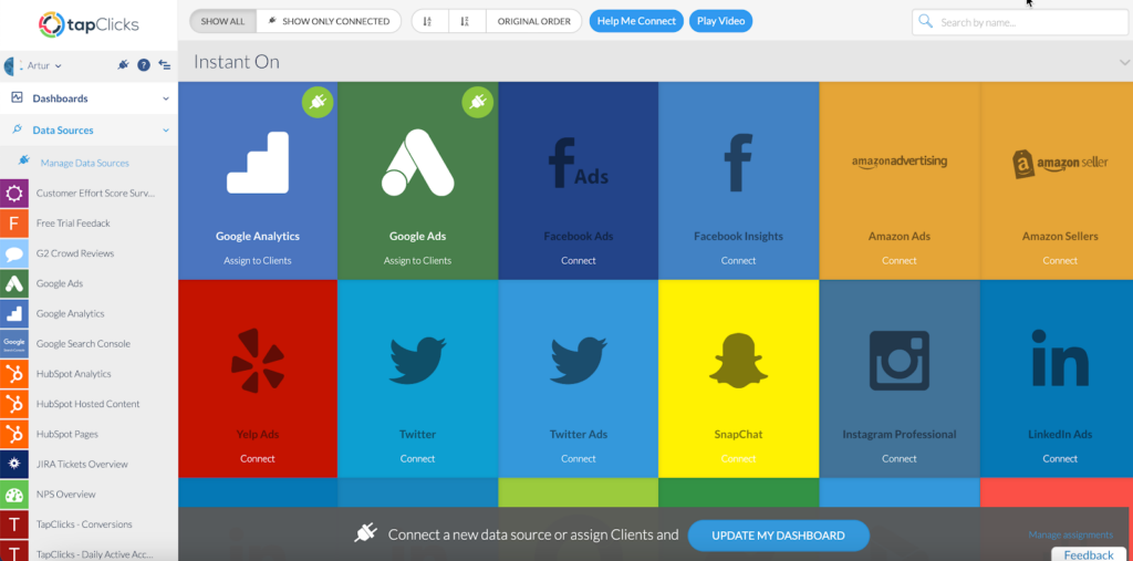
Start by pulling all your marketing and sales data into one place. TapClicks makes this step simple with Instant-On Connectors for platforms like Google Ads, Facebook Ads, LinkedIn Ads, Mailchimp, Shopify, and most major CRMs and SEO tools. No more logging into multiple platforms or stitching data together manually.
With TapClicks, you get:
-
Instant access to historical data – Pull up to 12 months of past performance, ideal for onboarding new clients or comparing year-over-year results.
-
No API upkeep – TapClicks manages API changes so you don’t have to. If something breaks, we fix it.
-
Permanent data storage – Keep your data even if a platform has a short lookback window or a client account is no longer active.
-
Smart Connector support – Import CSV files, spreadsheets, or connect tools that don’t offer standard APIs.
Agencies can store everything from website traffic to conversion data and use it to analyze long-term trends or build performance case studies. With all your data centralized in one dashboard, there’s no need to export, upload, or piece things together manually.
Automate Key Calculations
Manual reporting takes time. Agencies often track return on ad spend, cost per conversion, and engagement rates across platforms like Google Ads, Facebook Ads, and LinkedIn. Pulling raw numbers, calculating metrics, and formatting charts for each report slows teams down.
TapClicks removes those repetitive steps. Once data sources connect, the system handles calculations and updates visuals without manual input.
Common calculations marketing teams automate with TapClicks:
-
Cross-platform ROAS comparisons – Measure return on ad spend across paid channels, podcasts, radio, and social platforms.
-
Cost analysis – Combine cost per click, acquisition, and conversion into one complete cost view.
-
Engagement tracking – Analyze comments, shares, and reach across social media.
-
CTA performance – Review conversion data by landing page layout or button design to improve response.
Reports stay consistent across clients. A single dashboard template works for all accounts. Adjust one metric or visualization, and it applies everywhere.
TapClicks cuts out the manual work. Teams get more time to review strategy, less time fixing spreadsheets, and cleaner data to back every recommendation.
Recommended Reading: Life Before and After Social Media Dashboards (and Why 2060 Digital Has Never Looked Back)
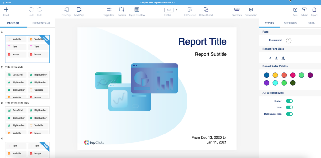
Create and Automate Your White Label Reports
Live dashboards show data in real time, but many clients still want scheduled reports in a shareable format.
TapClicks’ Report Studio handles that without the manual prep work. Teams can create white-label reports in PowerPoint, PDF, or Excel, fully branded and sent automatically.
Without automation, reporting takes hours. Most teams screenshot charts, paste them into slides, write context, and format everything by hand. That process slows things down and leads to errors.
TapClicks simplifies it.
With Report Studio, teams can:
-
Build reusable templates – Design once using client or agency branding.
-
Add one or more widgets – Drop in charts, metrics, and tables that update automatically.
-
Schedule delivery – Send reports on any schedule, such as weekly, monthly, or a custom timeline.
Each report pulls the latest data before sending. There’s no need to update visuals or rewrite commentary. Reports stay consistent, look polished, and reach clients on time.
Automation frees up hours. Instead of building decks, teams can focus on analyzing trends, improving campaigns, and helping clients understand what the numbers really mean.
Turn Key Performance Indicators Into Visual Insights With TapClicks

TapClicks turns raw numbers into visuals that make sense.
Marketing teams can track ROAS, leads, and conversion rates. Sales teams may follow the pipeline and revenue. Product teams look at active users and feature use. TapClicks brings all that data into one dashboard with real-time updates.
You can add widgets to highlight a specific metric. Use bar charts for comparisons, line charts for trends, and pie charts to show shares. Filters and drop-downs let users explore without extra tools.
Dashboards stay branded and organized. TapClicks stores historical data, so you can measure progress even after access to a platform ends.
FAQs About How to Build an Analytics Dashboard
How do I create an analytics dashboard?
To create an analytics dashboard, start by identifying your goal. Choose key metrics that align with what you want to track. Connect your data sources, select a platform, and decide how you want the data displayed. Use a layout that presents the most important numbers at the top and groups related metrics together.
Add only the visuals that help users take action and remove widgets that clutter the view or distract from the data that matters. Tools like TapClicks simplify this process by letting teams build once, then apply templates across clients with consistent formatting and branding.
What is an analytics dashboard?
An analytics dashboard is a visual tool that centralizes performance data in one place. It helps teams monitor KPIs in real time, identify trends, and make faster decisions. Dashboards are used in business analytics to track everything from campaign performance to operational efficiency.
How to build a dashboard step by step?
To build a dashboard step by step, first define your reporting goal. Next, list the metrics and data sources you’ll need. Connect those sources, map out the layout, add charts like bar graphs or line charts, and test for accuracy. Once complete, automate data refresh and report delivery.
How do I create a data visualization dashboard?
To create a data visualization dashboard, focus on turning raw numbers into clear insights. Choose visuals like line charts, pie charts, or heat maps that match the type of data. Make the experience easy to scan so users can explore trends and extract detailed information quickly. A strong dashboard improves customer experience by making data more accessible and actionable.