
The Only Modern Data Visualization Guide You’ll Ever Need
You’ve probably seen interesting data visualization examples that make insights obvious in seconds.
A clear modern data visualization lets you explain complex information, highlight trends, and identify patterns without confusion.
In this guide, you’ll learn how to choose the right charts and create visualizations that actually make sense to your audience.
What Is Data Visualization?
Data visualizations help turn raw numbers into clean visuals that make your data easier to understand and share. When you create the right visual, you guide your audience toward the result that matters.
Look at interesting data visualization examples from recent years. You’ll see animated bar races, scroll-based timelines, and dashboards that update in real time. These formats work because they keep the present data clear.
You don’t need to design anything complicated. A creative visualization that presents the right details with a clean layout can make the biggest impact.
For example, “NASA’s Eyes on Asteroids,” a cool data visualization, allows you to track the paths of asteroids moving through the solar system. It simplifies something technical and makes it easy to explore.
A well-built chart helps people see what matters without extra explanation.
How Modern Data Visualization Differs From Traditional Methods
Static reports once ruled business communication. You’d print a chart, drop it into a slide, and explain it during the meeting. That worked when data moved slowly. Today, things change by the hour, and your visuals need to keep up.
Modern data visualization gives you more than a single snapshot. It updates automatically, connects to live sources, and responds to input. You can also apply filters, select a time range, or hover for extra context.
Traditional charts stay fixed. You design once and share the same view with everyone. In contrast, an interactive data visualization responds to real questions and reflects live data.
An interactive visualization also supports better decision-making. Your audience can explore results on a single screen rather than flipping through pages or switching tabs. That saves time and keeps everyone focused.
Benefits of Modern Data Visualization
Use data visualization on your personal projects to:
-
Simplify complex data - Turn large datasets into clear visuals. Charts and graphs help you explain more in less time.
-
Spot trends faster - Use visuals to highlight key shifts, patterns, and outliers.
-
Support real decisions - An interactive chart lets you explore results and draw conclusions without needing a statistical background.
-
Communicate clearly - Build visuals that give enough background so the data makes sense to anyone in the room.
-
Work across teams - Make it easier for others to understand your message without extra explanation.
-
Track results over time - A flexible setup makes it easy for you to explore different time periods and compare performance.
-
Apply visual analytics - Use data patterns to guide your next move instead of relying on assumptions.
Types of Data Visualization Charts
The list below will help you pick the right chart based on what you need to show and who needs to see it.
Bar Chart
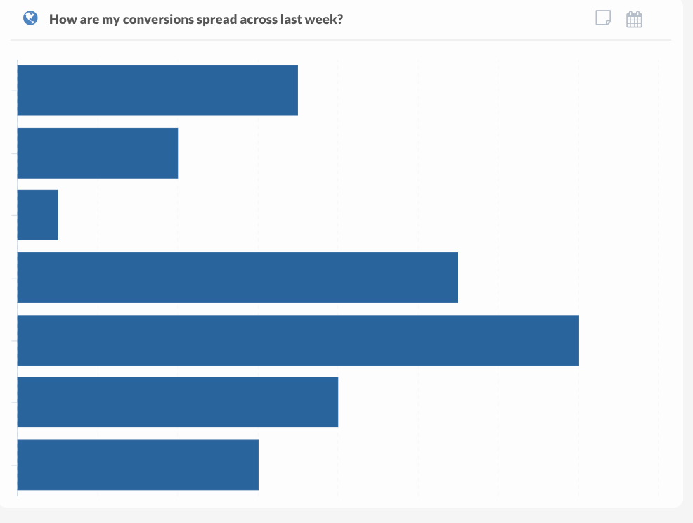
Comparing results across categories becomes easier when you use a bar chart. Each bar runs horizontally and displays the value of a single category. Longer bars indicate stronger performance, while shorter ones highlight areas that may need attention.
In a horizontal bar chart, the categories are listed along the vertical axis, and the values are measured along the horizontal axis.
Use bars when comparing survey responses, budget allocations, product sales, or marketing performance. The layout gives clarity to understand key differences without the need for extra commentary.
Since bar charts represent numerical values, people with different levels of data experience can interpret the results with ease. These visuals often get widely shared because they’re clean, simple, and effective.
A well-designed chart communicates real value by focusing attention where it matters most.
Column Charts
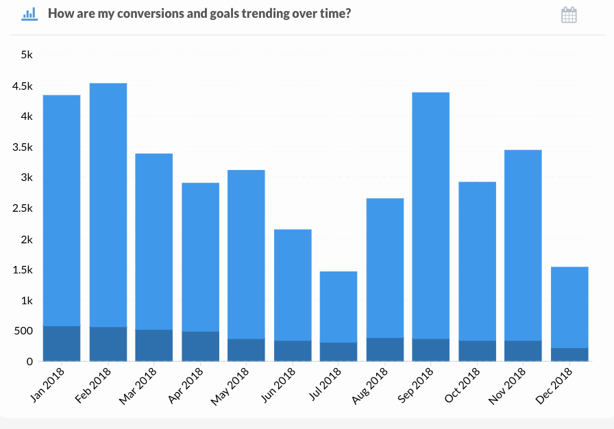
Time-based trends require a visual that guides your audience from one moment to the next. A column chart does that using vertical bars arranged chronologically. Each bar represents a specific point in time, such as a day, week, month, or quarter.
The chart typically includes an x-axis for the time periods and a y-axis to reflect values. Bar height varies with the data, which helps people spot spikes, dips, or consistency across a timeline. Labels and spacing keep everything organized and readable.
Showing performance metrics that shift over time works well with a column format. You can use it to display customer signups by week, campaign reach by month, or sales volume per quarter.
By focusing attention on movement, column charts turn raw data into a sequence of visible outcomes. Viewers follow along easily and connect past performance with current results.
You’ll notice better engagement when reports include visuals that align with how people interpret time. A column chart supports the natural reading flow and improves comprehension.
Line Graphs
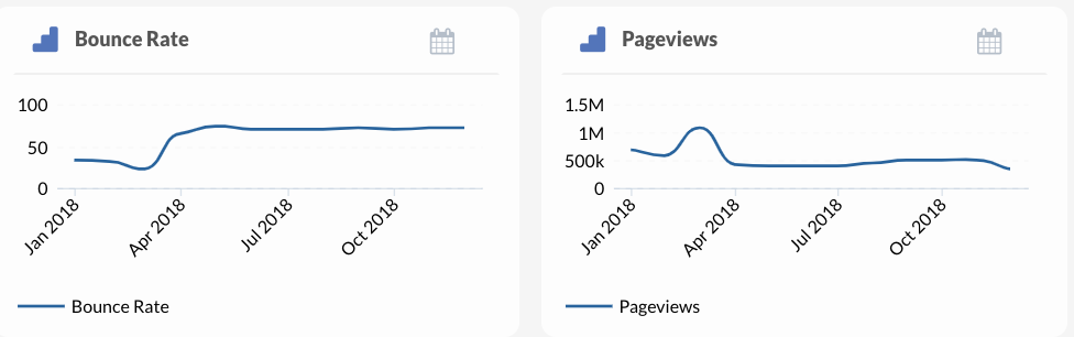
Tracking change across a timeline calls for a visual that connects individual data points. A line graph offers that connection by plotting values in a continuous sequence. Each line represents a trend you want your audience to follow.
Line graphs often feature time intervals along the x-axis and measured values along the y-axis. As each data point connects to the next, patterns emerge. People can interpret growth, decline, or plateaus without needing your explanation.
You can use a line graph to present recurring metrics like daily transactions, monthly revenue, or conversion rates over a set period. Viewers quickly recognize where performance shifts and how those shifts develop.
Comparing multiple lines allows you to evaluate different products, campaigns, or teams. Side-by-side trends appear in one space, which gives your audience clarity without the need to scroll or jump between visuals.
Pie Charts
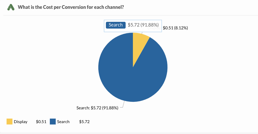
Pie charts help you show how each part compares to the whole. When you look at a pie chart, each slice stands for one category. The full circle always represents 100 percent. You can quickly understand proportions without digging through a table.
Try using pie charts when you need to compare a few categories. Budget breakdowns, demographic splits, or product sales share work well in this format. With no more than five or six slices, you keep everything readable.
Label each slice directly and use colors that stand out. Avoid relying only on a legend.
However, stay away from these charts when values are too similar. Small differences look the same once sliced. In those cases, bar charts often work better.
You’ll find pie charts most useful when you want to make a quick point. Use them in client presentations, reports, or dashboards where fast understanding matters.
Scatter Plots
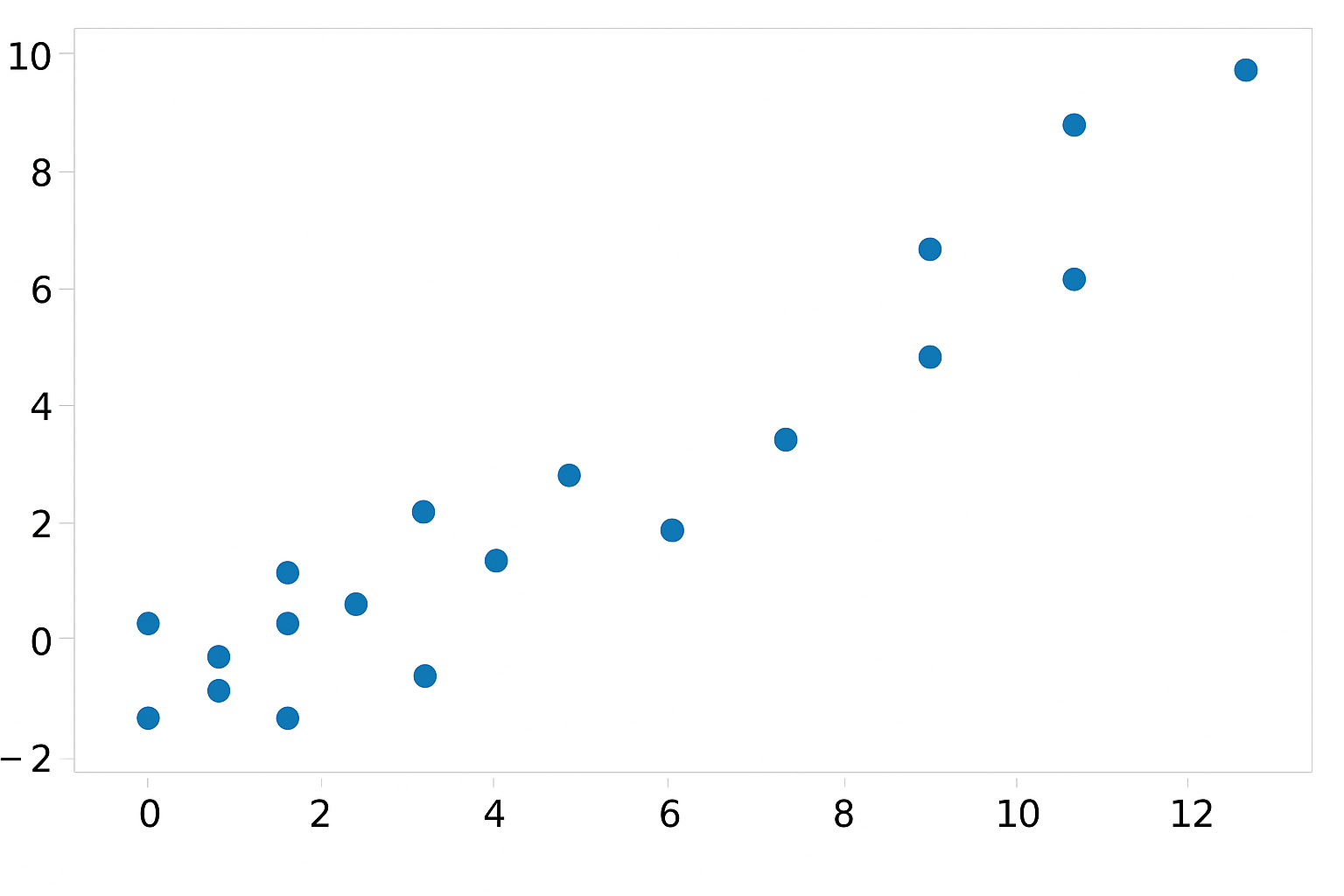
Scatter plots let you compare two different variables and find patterns. Each dot on the chart stands for one item. The horizontal and vertical positions show how two metrics connect.
Use scatter plots to explore relationships like ad spend versus sales or bounce rate versus page load time. Your audience can spot clusters, outliers, or trends just by glancing at the layout.
Label the axes clearly so people know what the numbers mean. Add color if you need to compare different groups in the same space. Grouping this way lets you show more without crowding the chart.
A trend line can help show the overall direction. When your readers see it, they won’t waste time figuring out what the dots imply.
Scatter plots make sense when you’re trying to answer questions about correlation. You don’t need to explain every detail. The format makes your point fast.
Use scatter plots to break down large datasets and highlight key takeaways.
Bubble Charts
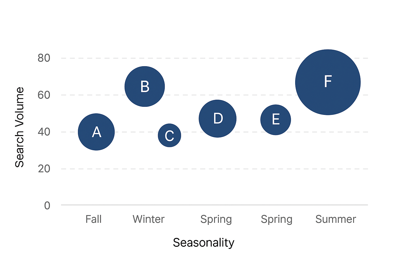
Bubble charts offer a way to present three variables in one graphic. Position handles two values, and bubble size adds a third. The visual depth adds context without making the layout feel heavy.
Each bubble marks one point in your data. Horizontal and vertical axes show relationships between two key metrics. Bubble size highlights scale, such as sales volume or visit count.
Add short labels or hover tooltips to keep the chart clear. Group bubbles by color when comparing categories. Space them out to avoid overlap. Clarity matters more than squeezing in every entry.
For example, a bubble chart shows which websites have the most traffic by plotting user engagement, time on site, and visit count. Each bubble shows the level of importance without needing extra text.
With the right layout, you’ll get a visually stunning result that captures attention and shares insight fast.
Heat Maps
Heat maps use color to compare numbers across a matrix. Higher values appear in darker shades, while lighter tones show lower activity. The entire layout makes it easy to read trends without any explanation.
When you want to highlight density or intensity across two dimensions, this format works well. User activity on a website, content engagement by hour, and platform usage by region all fit naturally.
Set up the map with rows and columns that reflect your chosen dimensions. Time, location, or content types make strong options. Add shaded areas to call out peaks or weak spots. Readers won’t waste time scanning numbers because the color leads them straight to the answer.
Pair the map with a scale legend to help people connect color with meaning. If you’re reporting to stakeholders, a heat map gives context fast.
Group related values together so patterns form more clearly. Consistent color gradients keep the reading experience smooth. Use colorblind-friendly palettes and provide alternative text or annotations to improve accessibility.
Network Diagrams
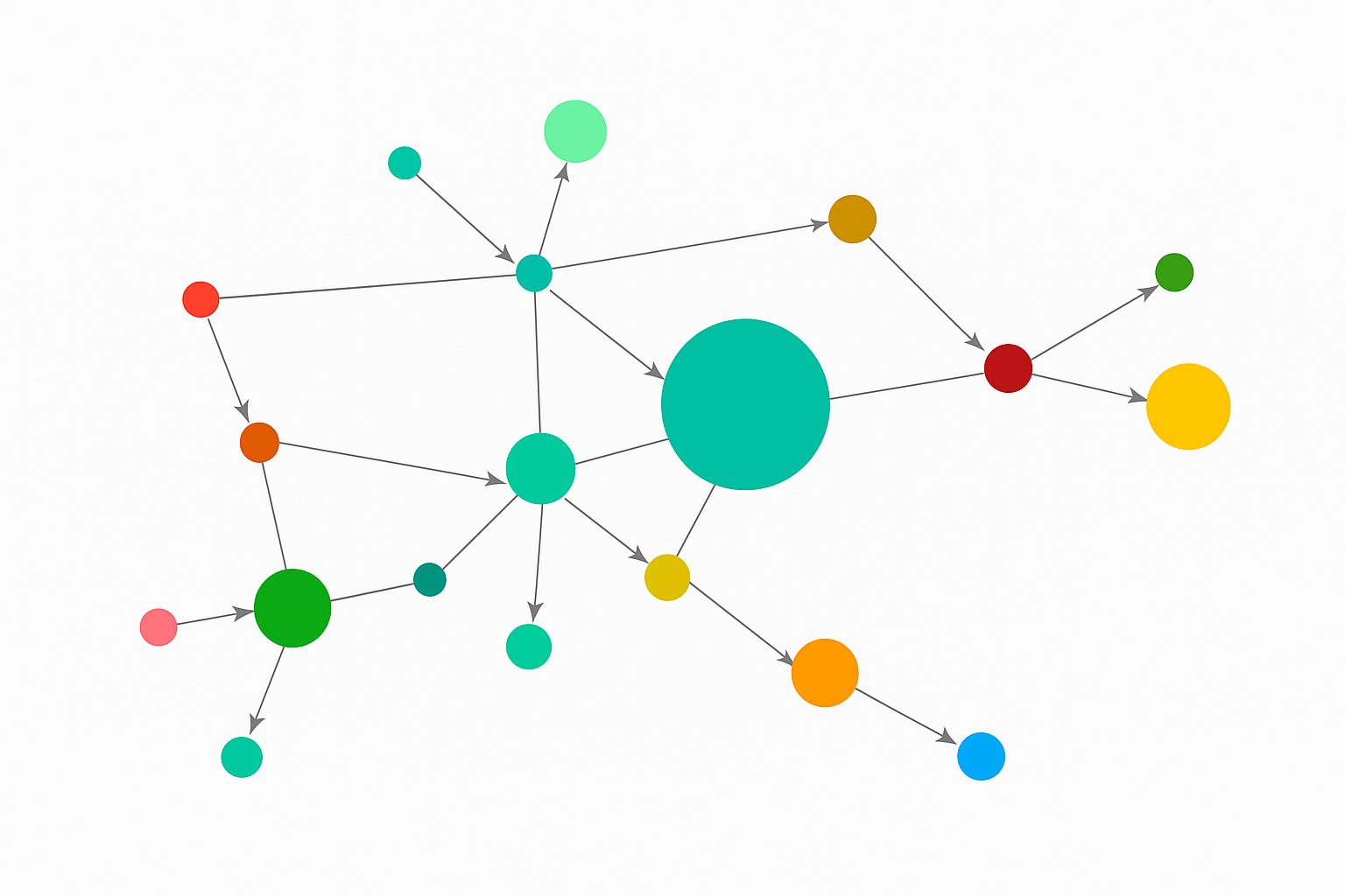
Network diagrams break down how pieces connect. Each point, or node, shows one item. Lines between them show the relationships. The shape of the diagram tells your readers how everything links.
Use network diagrams to explain flows or connections in systems. For example, you can show how a website leads users through touchpoints or how customer data travels between tools.
Start by picking the main entities. Draw lines that show how each one interacts with the others. Add color to sort categories or highlight strong links. Vary the size of each node if one area needs more attention.
People grasp relationships faster when they see them. You know where things link or break apart without needing long explanations.
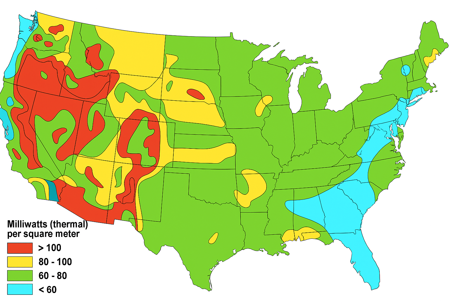
Choropleth Maps
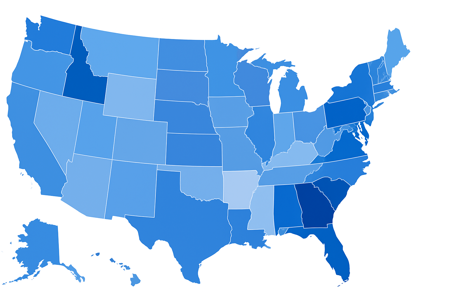
Choropleth maps compare numbers by location using color. Each region on the map shows a different shade based on a value.
When you want to show how data varies across areas, these maps work well. You might track ad performance by state, app users by country, or population shifts by zip code. The color tells the story before anyone reads a number.
Pick a color scale that highlights differences. Dark tones signal higher values, and lighter ones show where things drop off. Include a clear legend so readers don’t have to guess.
For your readers to make quick comparisons, the structure should stay simple. A strong layout means no one needs to hunt for answers.
Sankey Diagrams
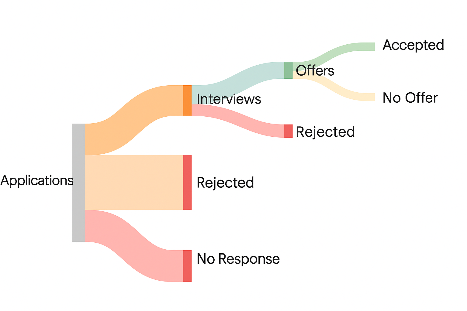
Sankey diagrams trace the flow of values between stages. The width of each path shows how much passes from one group to another.
Start by placing your sources on the left. From there, draw lines to each outcome on the right. The size of each connection shows how much moves through that step.
Color each path to help separate categories. Use consistent spacing to avoid confusion. The layout matters as much as the data. Tidy charts help people understand quickly.
Use Sankey diagrams when steps or losses matter. For example, show how a budget breaks down or how leads move through a sales funnel. These visuals help identify where the largest shifts happen.
You can build these for marketing, finance, logistics, or support operations. Any process that splits and moves between layers works well here.
Data Sources You Can Visualize
You can’t build clear charts without a solid visualization source. Strong data turns your work into a beautiful visualization that speaks for itself. When your source is accurate, every chart becomes more useful, more trusted, and easier to explain.
Customer Relationship Management (CRM) Systems
When you’re tracking sales performance, your CRM becomes your best data source. It records deals, contacts, and activities that shape every pipeline. You can chart lead conversion, view deal value by stage, or filter performance by rep. Those patterns matter more than a static list ever could.
Visualizing CRM data reveals what’s growing and what’s stuck. A bar chart can show the leads gained each month. A pie chart can show how sources like email or paid ads contribute to closed deals. These views help you coach, plan, and prioritize faster.
Let your sales team skip the spreadsheets. With real-time visuals, everyone can see which deals need attention. You’ll stop chasing updates and start using insights to guide your next steps.
Build clear agency dashboards from your CRM. Make each chart speak to the goal. Let the data support smarter decisions, not just record the past.
Web Analytics
Site traffic alone doesn’t show what matters. You need to see which pages attract the most attention, how visitors behave, and what leads them to act. Web analytics tools collect this data, but a visual dashboard puts it in context.
Charts built from analytics show bounce rates, conversion flow, and user paths. A line graph can track session growth over time. A heat map reveals where people click or pause. These views help you fine-tune pages without second-guessing user behavior.
Combine your analytics with campaign data to find what drives quality traffic. Filter by source, device, or page type to spot trends. Interactive visuals let you explore time periods, campaign impact, and performance drops more clearly.
When you can see engagement patterns, you can fix weak spots fast. You’ll know which content converts and which pages stall. Your site becomes easier to improve, one chart at a time.
Advertising Platforms
Paid ads deliver fast results, but only if you track what works. Ad platforms store performance metrics that guide smarter spending. A visual dashboard gives you the clarity you need to adjust fast.
Use the column to compare costs across platforms. Let line graphs highlight click-through trends over time. Pie breaks spend by campaign or audience type. These formats help you explain ROI without digging through raw numbers.
If you’re managing multiple ad accounts, visuals keep things organized. Compare performance across channels in seconds. Spot which ad sets drain budget and which ones deliver strong returns.
Build visuals around goals. Focus on conversions, not just impressions. Track what leads to revenue, not just clicks. You’ll improve campaigns and reduce waste, all from one place.
E-Commerce Platforms
Order data shows what shoppers want. E-commerce platforms collect that data with every sale, view, or abandoned cart. Visualizing it helps you turn that stream of actions into clear decisions.
Charts let you compare top products, watch revenue trends, and monitor return rates. A bar chart can show daily sales, while a line graph can measure average order value. With the right visuals, trends jump out before issues grow.
Pair visuals with filters to check performance by product line, time period, or traffic source. You’ll learn when people buy most and what they skip. That knowledge improves campaigns, stock levels, and promotions.
SQL Databases and APIs
Structured data powers operations. Your SQL databases and APIs hold custom data you won’t find in pre-built tools. Use them to track app activity, customer behavior, or internal KPIs. Once connected, your visuals update without manual effort.
A dashboard built from SQL gives you custom views. You decide which fields to pull and how often to refresh. APIs extend that flexibility by pulling live data from platforms like Stripe or HubSpot.
Charts from these sources show exactly what your team needs. Watch user signups in real time. Break down sales by product line. Explore retention by cohort. Each graph connects back to your live operations.
You don’t need to reformat or upload files. Just set up the query, and your dashboard runs on fresh data.
Excel/CSV Uploads
Spreadsheets remain useful. You might export data from a CRM, survey, or reporting tool. Turning that file into a dashboard adds meaning and speed to your insights.
Upload the file. Pick a chart that matches your structure. Bar charts highlight totals. Line graphs show changes over time. Pie charts compare segments. These visuals help your audience find the signal in the noise.
Files work best for one-time snapshots or early-stage projects. You can show results without needing a full database. Share a product launch report or summarize an internal survey with just one upload.
Start with clean columns and rows. Let your chart do the explaining. Use visuals to support your story. Even simple data deserves a sharp presentation.
How to Build a Beautiful Data Visualization
Follow these steps to create visuals that speak clearly and leave no confusion behind.
-
Define your goal - Decide what message you want to deliver. A single focus will make every design choice easier.
-
Know your audience - Think about what they care about and how familiar they are with the data.
-
Pick the right format - Bar charts work best for comparisons. Line charts make trends easy to follow. Skip pie charts if you’re working with more than a few categories.
-
Simplify your layout - Remove anything that doesn’t help the reader get to the main point. Keep the space clean.
-
Use color to highlight - Show differences, not distractions. Choose shades that support your story, not fight it.
-
Add helpful labels - Every axis, title, and number should be easy to understand without extra explanation.
-
Make interaction smooth - A strong data visualization tool lets users explore the chart directly.
-
Design for all screens - A well-made infographic shows insight quickly and stays user-friendly on any device.
Upgrade Your Dashboards and Data Visualization With TapClicks

TapClicks helps you turn raw numbers into clear, useful dashboards. You can highlight key KPIs with big numbers, lay out detailed campaign data using a data grid, or compare results with simple bar charts.
For trends over time, use line charts. When showing two types of data, combine them in a combo chart. To track funnel stages or user drop-offs, go with a funnel chart.
Need to visualize regions or audience segments? Geo charts and bubble charts offer ways to show patterns that matter. Each tool is easy to customize, even without technical skills.
FAQs About Modern Data Visualization
What are some of the best data visualization examples used in modern reporting tools?
Some of the best data visualization examples used in modern reporting tools include the Cholera Outbreak Map by John Snow, which visualized the source of a deadly epidemic, and The Hello Sun app by Small Multiples, which explains how sunlight interacts with your home. Tools like the Screenplay Dialogue Breakdown reveal how much dialogue in major films is spoken by male and female characters. Cell Towers of the World gives a global overview of tower locations, while the New York Times shows how different industries performed after the Great Recession in the US. These examples combine function and clarity to turn raw data into actionable insights.
How can geospatial visualization improve location-based business insights?
Geospatial shows data in map form using different shapes and colors, helping you compare performance by region, spot location trends, and guide territory planning. A retailer could see which store locations underperform or which cities show the most online activity.
What is creative data visualization and when should you use it?
Creative data visualization strategy combines unusual formats, visual storytelling, and design techniques to explain information in a more engaging way. Use it when your data needs a stronger narrative or when you’re presenting to non-technical audiences who care more about clarity than technical depth.
What are the different types of data visualizations and how do you choose the right one?
The different types of data visualizations include bar charts, line graphs, pie charts, heat maps, and scatter plots. Choose the right one based on what you’re trying to show, such as trends over time, comparisons, proportions, or relationships.