Domo vs Tableau: Which BI Tool Works Best for Marketing?
Domo vs Tableau comes up when teams start asking harder questions about their data. Both tools promise answers, insights, and better decisions, yet they feel very different once you look closer.
One leans toward all-in-one analytics, the other toward deep visual analysis. That difference matters more than most people expect.
This article looks at how Domo and Tableau compare in everyday use, what each platform prioritizes, and which situations favor one over the other.
TL;DR
-
Domo vs Tableau comes down to automated analytics versus deep visual analysis.
-
Domo centers on dashboards, alerts, and workflows within one platform.
-
Tableau focuses on chart control, calculations, and analyst-led exploration.
-
Agencies often deal with ongoing setup and upkeep in both tools.
-
Many marketing agencies consider TapClicks for automated, client-ready reporting.
What Is Business Intelligence?
Business intelligence (BI) refers to software that helps people turn raw data into information they can actually use.
A business intelligence platform connects to multiple data sources and pulls in complex data from cloud apps, data warehouses, and an SQL server.
It then presents that information through interactive dashboards, charts, and custom reports.
These tools support data analytics tasks such as data visualization, data modeling, and data cleaning.
Business users can explore data, review trends, and create reports without digging through raw numbers. Data analysts can work with large datasets and build deeper analysis when needed.
This context matters in the Tableau vs Domo discussion.
Both platforms support data analysis and dashboard creation, but they differ in how users access data, design dashboards, and work with multiple data sources.
What Is Domo?

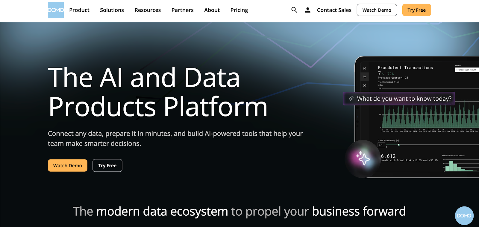
Image source: domo.com
Domo is a cloud-native BI platform that connects data sources and turns them into visual, interactive insights.
It connects to many data sources, including cloud apps and data warehouses, and then prepares that information through managed data pipelines.
Teams use Domo to explore data, review trends, and present information through interactive dashboards that update automatically.
The platform supports both data teams and non-technical users. Data teams handle data blending, transformations, and permissions. Business users focus on data access and dashboard interaction through an intuitive interface.
This setup allows people with different skill levels to work from the same analytics platform without relying on custom SQL queries for routine reporting.
Key Features
-
Connectors that pull data from common business and cloud applications
-
Interactive dashboards created with drag-and-drop tools
-
Embedded dashboards for sharing insights inside other products or portals
-
Artificial intelligence (AI) features that provide alerts and trend insights
-
App Studio for creating analytics apps that pair charts with user actions
-
Workflow automation that links data changes to follow-up tasks
-
Mobile access for dashboards and alerts
-
Permissions and row-level security controls
Strengths of Domo
Domo provides dashboards, apps, and automation in one system. Executives often use it to review summary dashboards on desktop or mobile.
Other teams rely on apps and workflows to respond when metrics change. Embedded dashboards also allow organizations to share analytics with external users.
Limitations of Domo
Domo has a steeper learning curve during setup, especially around data modeling, workflows, and permissions. Costs often increase as data volume, user count, and feature usage grow.
Customization options for layout and reporting formats are restrictive compared with tools focused only on data visualization.
Marketing teams also need extra configuration to support recurring client reports.
What Is Tableau?

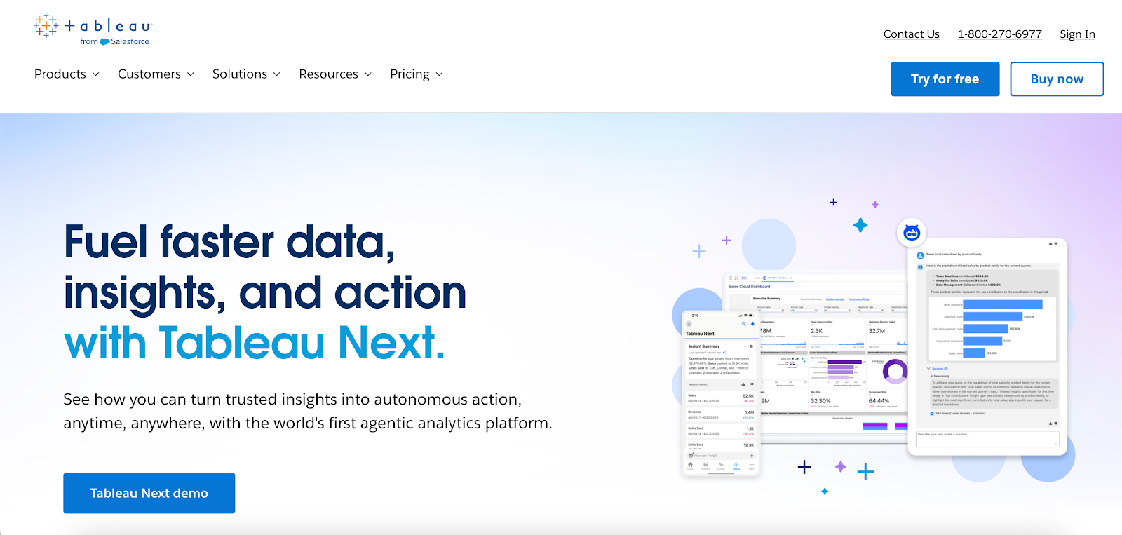
Image source: tableau.com
Tableau is a business intelligence application that many teams treat as a data visualization tool first. It helps users connect to diverse data sources, explore data, and present data through interactive visuals.
Tableau includes Tableau Desktop for analysis and dashboard creation. It also includes Tableau Server and Tableau Online (formerly Tableau Cloud) for browser-based access to published Tableau dashboards.
Business users usually consume dashboards and key performance indicators (KPIs). Data teams handle deeper data exploration, calculations, and publishing.
Key Features
-
Tableau Desktop for data exploration, dashboard design, and analysis
-
Tableau Server and Tableau Online for browser-based access and sharing
-
Drag and drop interface for building charts and complex visualizations
-
Advanced features such as calculated fields, parameters, and level of detail expressions
-
Data connectors for databases, cloud storage, and common business tools
-
Embedded analytics for placing Tableau dashboards inside other applications
-
Integrations with external tools such as Python and R for advanced analytics
-
AI features that support predictive marketing analytics
Strengths of Tableau
Tableau supports detailed visual analysis, especially when analysts need fine control over charts and complex visualizations.
Teams often use it to build dashboards for business operations, customer behavior, and performance tracking.
It also offers flexible deployment. Organizations can run Tableau Server in their own environment, deploy it in a public cloud, or use Tableau Online as a hosted option.
Limitations of Tableau
Tableau has a steeper learning curve once users move past basic charts. Advanced features like calculations and level-of-detail expressions take time to master.
Tableau dashboards can also slow down with large datasets or complex logic, so performance often depends on data preparation and model setup.
Domo vs Tableau: A Feature Comparison
Once teams start using the tools, the differences between Tableau and Domo become easier to spot. The two platforms support similar outcomes, but they handle analysis, dashboards, and reporting differently.
Ease of Use and Learning Curve
In Domo, even non-technical users interact with dashboards through filters, alerts, and preset views.
Most changes to logic or layout stay with admins or the data team. Marketers and executives usually review results rather than edit dashboards.
Tableau places more responsibility on analysts. To perform data analysis or modify dashboards, users work with calculations, parameters, and data relationships.
Business users typically consume published dashboards instead of creating their own.
Data Visualization Capabilities
Tableau stands out when teams need to visualize data with precision. Analysts can adjust chart behavior, formatting, and interactions in detail, which supports complex visualizations and exploratory analysis.
Domo emphasizes interaction within dashboards. Users drill into metrics, compare time periods, and switch views. Design controls exist, but they don’t match the depth available in Tableau.
Automation and Reporting
Domo includes workflow automation that responds to data changes. Alerts, notifications, and follow-up actions can trigger automatically when metrics shift, which reduces manual reporting tasks.
Tableau supports scheduled refreshes and alerts, but report delivery and exports often rely on manual processes or third-party tools.
AI and Advanced Analytics
Domo’s AI features focus on alerts, guided insights, and trend detection connected to dashboards. Some teams also use these tools for basic predictive modeling.
Tableau’s AI features support analysts during data exploration. Tableau Agent and Tableau Pulse help users ask questions, evaluate scenarios, and review predictions while working inside the authoring environment.
Scalability and Deployment Options
Domo runs as a cloud-only analytics platform, which means every user accesses the same hosted environment.
Updates, security, and access follow a single model, and teams don’t manage infrastructure or deployment choices.
Tableau offers multiple deployment paths through Tableau Server and Tableau Cloud. Some organizations use Tableau Server to keep analytics within their own environment. Others choose Tableau Cloud for a fully hosted option.
Tableau also integrates easily with Microsoft tools, which makes adoption smoother for teams already working in that ecosystem.
Why Domo and Tableau Fall Short for Marketing Agencies
Domo and Tableau weren’t created for marketing agency workflows. Agencies manage multiple clients, rely on frequent reporting cycles, and need outputs that look consistent without analyst involvement.
That’s where the key differences start to show.
Tableau places reporting work in the hands of analysts who design interactive dashboards and manage logic. For agencies, reports often depend on technical staff and manual handoffs.
Domo offers an all-in-one solution with dashboards, automation, and apps. However, marketing agencies still deal with ongoing setup to handle client-specific metrics, permissions, and delivery formats.
In real-world scenarios, those gaps slow client reporting as accounts increase. This is where TapClicks enters the conversation.
It pulls marketing data together and manages recurring client reports without requiring analyst-driven BI tools.
TapClicks: The Best Alternative to Domo and Tableau

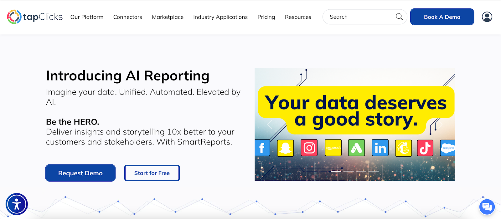
TapClicks is a marketing intelligence and reporting platform created specifically for agencies and in-house marketing teams.
Instead of adapting a general business intelligence platform, TapClicks starts with marketing data, agency workflows, and client reporting requirements.
The platform connects to advertising, analytics, and customer relationship management (CRM) systems through seamless integration.
That data flows into a tightly integrated reporting environment where dashboards, reports, and insights stay consistent from one client to the next.
How TapClicks Handles Marketing Reporting
TapClicks focuses on repeatable marketing reporting rather than one-off analysis. Dashboards refresh automatically.
Reports run on a schedule. Metrics and layouts stay consistent, so teams don’t rebuild the same reports every week.
Marketers work in a familiar environment that mirrors how campaigns, budgets, and channels operate. Time goes into reviewing performance and preparing recommendations, not formatting charts or exporting files.
Client delivery is easy and simple. Reports can be shared as dashboards, slide decks, PDFs, or email summaries, depending on how each client prefers to review results.
TapClicks AI Tools Agencies Use Most
TapClicks AI adds explanations directly into reports, so insights don’t get buried in metrics.
-
AI agents: Create written summaries that highlight performance changes, pacing issues, and next actions inside dashboards and reports.
-
Anomaly detection agent: Flags unusual changes in metrics such as spend, click-through rate (CTR), or cost per click (CPC), with context on what changed.
-
Budget insights agent: Reviews planned versus actual spend and highlights pacing issues that affect campaign outcomes.
-
Campaign performance agent: Produces plain language summaries for client updates and internal reviews.
-
Executive insights agent: Creates high-level summaries for leadership without requiring dashboard walkthroughs.
-
SmartSlides: Converts dashboards into presentation-ready PowerPoint or PDF decks with visuals and written insights.
-
SmartEmail: Sends scheduled email reports with AI-written highlights, no dashboard login required.
-
Data transformation agent: Creates custom marketing KPIs such as return on investment (ROI) or cost per acquisition (CPA) using plain language prompts.
Why Marketing Agencies Choose TapClicks Over Domo or Tableau
Domo and Tableau focus on general data analysis and visualization. TapClicks takes a different angle, with more emphasis on marketing, reporting, and consistent client delivery.
For agencies that prefer reporting to run in the background while teams spend more time on strategy, TapClicks is worth a closer look.
Book a demo with TapClicks to see how automated, client-ready marketing reporting works in practice!
FAQs About Domo vs Tableau
Is Domo used for data visualization?
Yes. Domo includes interactive dashboards and visualizations that update as new data arrives. Teams use it to view trends, track performance, and share dashboards with internal and external users.
Are companies moving away from Tableau?
Companies reassess Tableau when reporting becomes slow to maintain or depends heavily on analysts. Others continue using it for advanced visualization and ad hoc analysis.
The decision usually comes down to how much time teams want to spend building and managing dashboards.
What is the best alternative to Tableau?
The best alternative depends on the use case. Marketing teams and agencies often look at TapClicks when they want automated reporting, scheduled delivery, and client-ready outputs without heavy setup.
What is Domo used for?
Domo supports data integration from many sources and presents that information through dashboards, apps, and alerts.
Organizations use it for performance monitoring, executive reporting, and workflow actions triggered by data changes.
