
8 Best Domo Alternatives to Consider in 2026
Domo is a familiar name in business intelligence (BI). Teams use it to connect data, create dashboards, and share insights. As data programs mature, many teams start asking, "Is this still the best option for us?"
That curiosity has pushed more buyers to explore Domo alternatives.
Today’s BI tools vary widely in how they handle reporting, automation, analytics, and AI. Some focus on deep analysis, while others prioritize ease of use or faster reporting.
This guide reviews the top alternatives to Domo, explains how they differ, and helps you narrow the list to tools worth serious consideration.
TL;DR
Here are the eight best Domo alternatives to consider in 2026:
-
Qlik Sense
-
Tableau
-
Microsoft Power BI
-
Looker
-
Sisense
-
Zoho Analytics
-
ThoughtSpot
What Pushes Teams Toward Domo Alternatives?
Teams rarely search for Domo alternatives on impulse. The question usually comes up after spending time on the platform and realizing that everyday work takes more effort than expected.
Many teams want a business intelligence tool that lets them analyze data without relying on technical experts for routine tasks. They expect to explore data, answer questions, and create interactive dashboards on their own.
When simple data analysis requires too many workarounds, productivity slows.
Flexibility matters as well. Teams often pull from multiple data sources and work with large datasets. They need dependable data integration and accurate reporting that doesn’t require advanced data modeling just to get results.
As expectations grow around embedded analytics, AI-powered insights, and natural language search, teams start comparing options.
When other options offer a more intuitive interface and transparent pricing, comparing alternatives to Domo becomes the practical next move.
Top 8 BI Tools to Try Instead of Domo
Let's look at the top eight alternatives to Domo that teams compare most often.
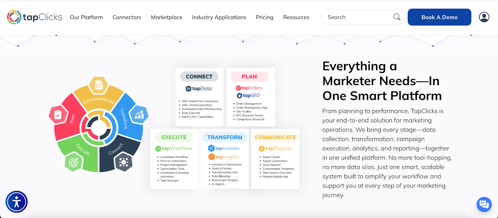
1. TapClicks
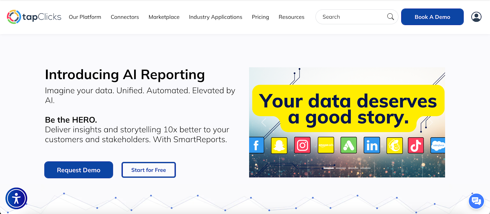
TapClicks is the most compelling Domo alternative for organizations that report on marketing performance every week.
It pulls campaign data from many sources, refreshes dashboards automatically, and produces client-ready outputs on a set schedule.
Analysts, marketers, and account managers spend less time pulling numbers and more time reviewing channel performance.
Key Features
-
More than 10,000 data connections
-
Scheduled dashboards and automated reports with charts, highlights, and branded layouts
-
SmartSlides for PowerPoint or PDF decks created from selected data and saved templates
-
SmartEmail for scheduled performance summaries delivered straight to inboxes
-
AI Insights Agents that write plain language summaries, flag pacing issues, and suggest next actions
Reporting That Replaces Manual Decks and Weekly Recaps
TapClicks doesn’t stop at dashboards. It produces finished deliverables.
Users create recurring reports once, then reuse them for weekly updates, monthly reviews, or quarterly business reviews (QBRs).
SmartSlides turns dashboards into presentations in minutes. SmartEmail sends summaries automatically, so stakeholders stay informed without logging in or requesting updates.
Data Analytics That Answers Performance Questions Faster
TapClicks organizes multi-channel performance in one view, so marketers can compare platforms without stitching results together.
Users drill into campaigns, spot winners and underperformers, and explain key performance indicator (KPI) shifts using filters and visuals instead of formulas.
Non-technical users explore data through dashboards rather than relying on analysts for every question.
Execution Tools That Keep Marketing Work on Track
TapClicks includes order and task tools alongside reporting. TapOrders captures campaign details at launch. TapWorkflow routes approvals and tasks to the right people.
Performance data reflects what was actually launched and changed, which keeps reporting accurately and aligned with execution.
2. Qlik
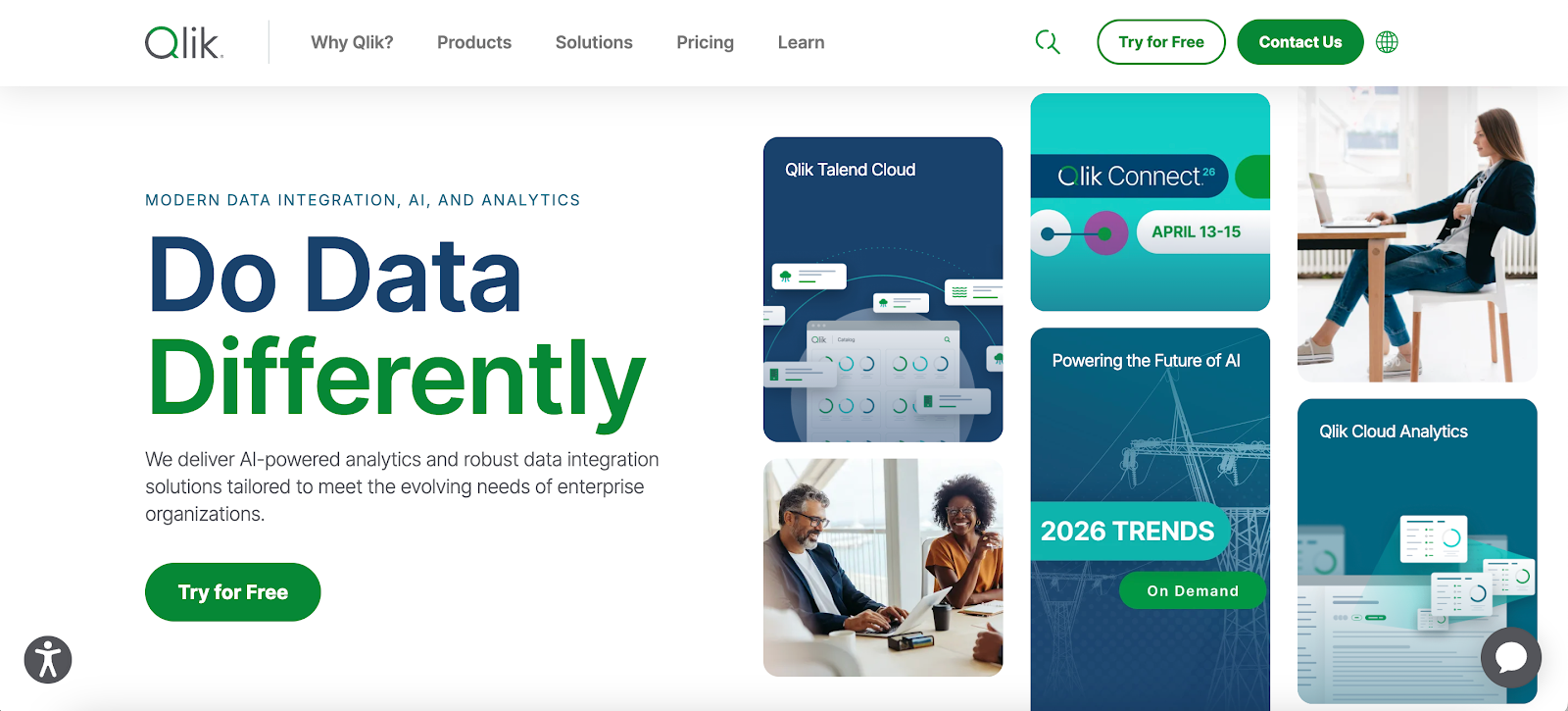
Image source: qlik.com
Qlik is a business analytics platform focused on data exploration and advanced analytics.
It uses an associative data model that lets users explore data freely, following relationships between fields instead of relying on fixed queries.
This model supports in-depth data analysis and helps surface patterns that may stay hidden in traditional client reporting tools.
Key Features
-
An associative data model that allows users to explore data in any direction
-
Advanced analytics features, including predictive models and automated machine learning
-
Natural language search for querying data using plain language
-
Advanced data visualization with highly customizable dashboards
-
Broad data connectivity to databases, cloud services, and data warehouses
Qlik works for organizations that handle complex datasets. It supports self-service analytics for experienced users and offers strong visualization capabilities for interactive dashboards.
At the same time, the platform assumes technical expertise, and many users report a steep learning curve before they feel comfortable building and maintaining analytics applications.
3. Tableau
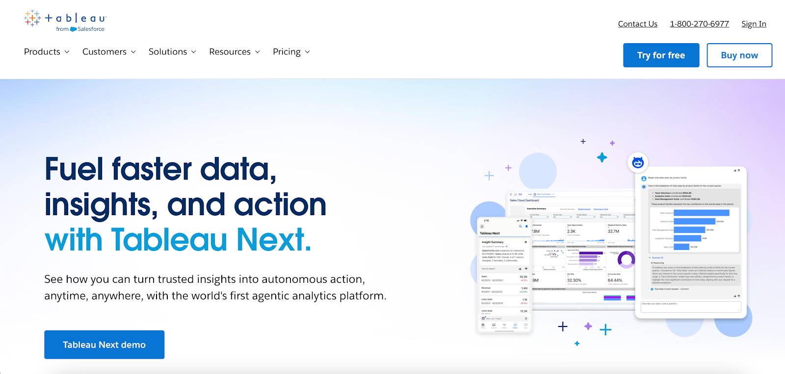
Image source: tableau.com
Tableau is a business intelligence application that supports browser-based analytics and self-service data access.
Non-technical users can visualize data through interactive dashboards. Analysts publish shared metrics and reports that others can explore without relying on prebuilt queries.
The platform supports a wide range of business analytics tools, including ad hoc analysis, interactive dashboards, and calculated fields for more advanced use cases.
Users can explore data visually to uncover insights, compare trends, and examine changes over time without relying on prebuilt queries.
Key Features
-
Interactive dashboards for self-service analytics and visual data exploration
-
Support for complex data models, including joins, relationships, and calculated fields
-
Broad data access through connections to databases, cloud services, and data warehouses
-
Collaboration features such as shared workbooks, permissions, and role-based access
-
Advanced features for in-depth data analysis, including level of detail calculations and table calculations
Tableau connects analytics to daily work through shared dashboards, subscriptions, and integrations with Slack and Microsoft Teams.
More advanced calculations and complex data models often require technical expertise, and dashboard performance depends on how well the underlying data is structured and optimized.
4. Microsoft Power BI
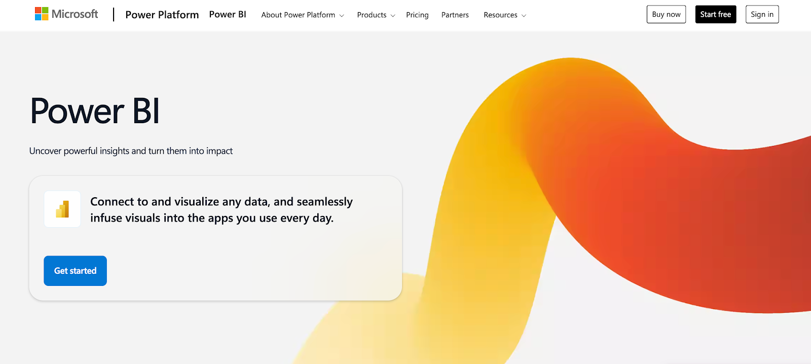
Image source: microsoft.com
Microsoft Power BI focuses on interactive reporting and visual data analysis within the Microsoft ecosystem.
Users work in Microsoft Power BI to connect to data sources, model datasets, and create dashboards, then publish them to the Microsoft Power BI service for sharing and collaboration.
The platform lets users explore data through filters, visuals, and natural language queries. It keeps reports embedded inside Microsoft tools such as Teams, Excel, and PowerPoint.
This keeps analytics part of everyday business workflows rather than separate reporting portals.
Data can also be managed through OneLake in Microsoft Fabric, which helps reduce data silos and maintain data accuracy within shared datasets.
Key Features
-
Interactive dashboards and reports built in Microsoft Power BI Desktop
-
Data connectivity to databases, cloud services, files, and OneLake
-
Semantic modeling and data analysis expressions (DAX) calculations for reusable metrics
-
AI-assisted report creation, summaries, and natural language exploration
-
Native integration with Microsoft services, including Teams, Excel, and PowerPoint
Advanced data modeling and DAX development typically require technical expertise. Dashboard performance depends on how well datasets are structured, particularly when working with large volumes of data.
5. Looker
Image source: docs.cloud.google.com
Looker queries data directly from databases and cloud data warehouses, keeping information in place rather than copying it elsewhere.
A shared semantic layer, defined using Looker’s proprietary modeling language, standardizes metrics and logic so results stay consistent wherever analytics appear.
Users explore data through interactive dashboards, drill into individual records, and ask questions using natural language features.
Data teams handle modeling, permissions, and access rules, while business users work within those definitions to derive actionable insights without writing queries.
Looker Studio, previously known as Google Data Studio, supports lighter reporting and ad hoc visualization alongside the core Looker platform.
Key Features
-
Semantic modeling using Looker’s proprietary modeling language
-
Direct data connectivity to cloud data warehouses without data replication
-
Interactive dashboards with drill-down and row-level exploration
-
Embedded analytics and application programming interfaces for custom workflows
-
Natural language data exploration for guided analysis
Looker requires upfront data modeling, which often involves technical expertise. Performance and usability depend on how efficiently data models and underlying datasets are designed.
6. Sisense
Image source: sisense.com
Sisense is an analytics platform focused on embedded analytics and application-level data experiences.
It’s commonly used when analytics need to appear inside products, portals, or internal tools rather than as standalone dashboards. Data stays governed while analytics integrate directly into existing applications and workflows.
Analytics can be created through both a visual interface and code.
Developers use JavaScript, application programming interfaces (APIs), and software development kits (SDKs) to embed charts, filters, and queries inside their own applications.
Natural language features let users ask questions, generate visualizations, and receive written summaries without writing queries, while data teams manage models and permissions.
Key Features
-
Embedded analytics using JavaScript, APIs, and the Compose SDK
-
Natural language analytics for querying data and generating visualizations
-
AI-generated narratives that summarize charts and trends
-
Custom visual components for application-level design consistency
-
Role-based access and multi-tenant security for embedded environments
Sisense often requires technical effort to configure and customize, particularly for advanced visualization and embedded scenarios.
Dashboard creation and user experience depend on configuration choices, JavaScript development, and familiarity with the platform.
7. Zoho Analytics
Image source: zoho.com
Zoho Analytics combines data preparation, reporting, data visualization, and embedded analytics in one web-based workspace.
It connects to more than 500 data sources, including cloud applications, databases, data warehouses, and flat files. Users can clean and model data, then build dashboards and reports with filters and drill downs.
Scheduled refreshes, alerts, and sharing help keep reports updated and distributed. Zia, its AI assistant, supports natural-language questions and automated summaries to help users extract insights from existing reports.
Zoho Analytics runs as a cloud service with access controls and sharing permissions. Embedded and white-label options let organizations integrate analytics directly into internal tools or customer-facing portals.
Key Features
-
Data connectivity to files, databases, cloud applications, and data warehouses
-
Self-service data preparation, modeling, and enrichment
-
Interactive dashboards and reports with filters and drill-down analysis
-
Zia assistant for natural language queries and automated insights
-
Embedded analytics and white-labeling for portals and internal applications
Advanced scenarios like complex formulas and SQL can involve a steeper learning curve.
Report exports and chart customization may feel limited, and performance can vary with very large or complex datasets.
8. ThoughtSpot
Image source: thoughtspot.com
ThoughtSpot is a business intelligence platform that relies on search-driven analytics rather than static dashboards.
Its Liveboards stay connected to underlying data and let users drill, filter, and ask follow-up questions without prebuilt drill paths.
Users interact with data through a search bar that accepts plain-language questions. ThoughtSpot’s relational search translates those questions into queries against governed datasets and returns charts, tables, or summaries.
Built-in AI adds automated insights such as anomaly detection, change explanations, and forecasts, all delivered directly within Liveboards rather than separate reports.
Data teams manage modeling, permissions, and governance, while non-technical users explore metrics within those guardrails.
Embedded analytics allow insights to appear inside tools like Salesforce, ServiceNow, or internal applications, keeping analysis close to daily work.
Key Features
-
Interactive Liveboards with drill-anywhere analytics connected to source data
-
Natural language search for ad hoc data exploration and query refinement
-
Automated insights for anomalies, trends, and forecasting
-
Code-based analysis using SQL, Python, and R in Analyst Studio
-
Embedded analytics for placing insights inside applications and internal tools
ThoughtSpot requires upfront data modeling to enable filtering and governance, which adds setup time.
Formula syntax differs from SQL or spreadsheet logic. Dashboard formatting and access workflows offer limited customization compared with fully custom visualization tools.
See How TapClicks Turns Campaign Results Into Shareable Insights
Domo is a broad business intelligence platform, yet many marketing teams deal with heavy setup, complex modeling, and ongoing upkeep.
Those demands slow reporting and make basic performance questions harder to answer.
TapClicks takes a different route. Automation handles data collection, normalization, and marketing reporting on set schedules, so manual prep doesn’t pile up.
Campaign orders, budgets, pacing, and results live in one place, which keeps reports connected to what actually launched and changed.
Analytics extend past static charts. AI-generated summaries explain performance shifts, flag pacing issues, and highlight trends inside dashboards, reports, slides, and emails.
Prep time drops, and sharing results with clients and stakeholders becomes easier.
The interface stays user-friendly, with prebuilt connectors and templates that shorten onboarding compared with general BI tools.
Seamless integration between marketing channels also reduces tool switching. Pricing remains predictable as usage grows instead of fluctuating with consumption.
Marketing teams weighing Domo alternatives often choose TapClicks for its powerful analytics capabilities shaped around everyday campaign workflows.
Book a demo to see how TapClicks compares to Domo in daily marketing operations!
FAQs About Domo Alternatives
What is similar to Domo?
Several analytics platforms offer capabilities similar to Domo, including TapClicks, Tableau, Microsoft Power BI, Qlik, Looker, Sisense, Zoho Analytics, and ThoughtSpot.
Each provides data connections, dashboards, and reporting. The main differences show up in setup effort, pricing models, and how closely the tool fits specific needs, such as marketing or embedded analytics.
Why is Domo so expensive?
Domo uses a consumption-based pricing model, so costs rise as data volume, refresh rates, and usage increase.
Organizations often also need technical resources for data modeling and platform upkeep. Those combined factors can make the total cost higher than expected over time.
How does Domo compare to its competitors?
Domo offers a wide range of analytics features, but competitors often focus on narrower use cases or simpler workflows. Some platforms emphasize self-service dashboards.
Others focus on embedded analytics, and marketing-focused tools like TapClicks prioritize automated reporting and campaign-level insights.