
3 Important Features to Consider When Choosing a Great Marketing Data Visualization Tool

It's our strong belief that a good marketing data visualization stack needs to include the ability to:
- Gather data from many disparate data sources.
- Store that data in a single location (such as a data warehouse) that's accessible to marketers and not just the data team.
- Do complex calculations on the data in order to create meaningful insights.
In this post, we'll discuss why the 3 features mentioned above are crucial and review how TapClicks' data visualization features solve these needs.
If you're interested in how TapClicks could work as a marketing data visualization tool for your organization, you can try it free for 14-days or schedule a demo to learn more.
How to Create Marketing Data Visualizations with TapClicks
First, let's look at the TapClicks features that allow you to create powerful marketing data visualizations.
Marketing Visualizations via Dashboards
TapClicks offers customizable dashboards that display your data. You can choose from several ready-made dashboard templates which include social media marketing channels, ad networks, and email campaigns, or you can create your own template from scratch.
Each dashboard can be customized to suit whichever campaign or client you want and configured to include whichever metrics (we call these widgets) you set up.
For example, you can include the CTR (click-through rate) for a digital marketing campaign and view this alongside the KPIs you set to monitor your marketing performance.
You can then visualize your sets of data in whatever type of chart you wish graph, pie-chart, bar chart, bar graph, etc.

The beauty of the TapClicks solution is that dashboards or visualizations can be turned into templates and applied across multiple dashboards. Agencies can create one dashboard for a specific type of report (e.g. digital marketing report) and filter the data to each client.
Here's a video showing how to create a dashboard with TapClicks:
Grant Access to Whoever Needs It
You can also grant permission for clients to access their data visualizations via their dashboards. Permissions can be set at widget level so you have complete control over what type of data and visualizations the client sees.
For example, you can customize access for different audiences. So, if you're running campaigns for a national business and you don't want an individual seeing your budget for a Facebook Ads campaign but you do want the regional manager to see it, you just configure the widget to reflect that.
The bonus of configuring your widgets to reflect what you want to a specific audience is that stakeholders have access to the right data that's relevant to them whenever they want.
For example, you can set up a report to feature specific locations (shown below) and set the permissions for that information to be viewed by the key stakeholders in that area. Stakeholders can hover over the region on the heat map and the metrics for that region will be brought up.

Providing clients with access to their own dashboards helps prevent any last minute requests for ad hoc visualizations.
Distribute Your Marketing Data Visualizations Automatically via TapClicks Powerful Report-Builder
As well as viewing your data visualizations via dashboards, marketers also need to send them to clients and stakeholders via reports.
TapClicks Report Studio allows you to create and send PowerPoint-style reports that are automatically updated with your latest data. These can be scheduled to be sent out to clients or stakeholders whenever you want. For agencies with many clients, this saves a massive amount of time.
As with the dashboards, you can use our white label templates as a starting point and customize as many different reports as you like (e.g. social media report, SEO report, PPC, weekly marketing report, etc.). You can create a master report template that can be used across several campaigns or clients, saving a huge amount of time.

Like so many of the TapClicks features, you need only set up the reports once and they'll be there, ready for you to distribute your marketing data visualizations, whenever you choose.
Reports can be distributed via email or PDF (PPT or CSV) to the people you want them to go to (e.g. clients and stakeholders) allowing them to review campaign performance against the marketing plan and revise marketing strategy, if needed.
Here's a video showing how to schedule reports with TapClicks:
The Challenges of Creating Marketing Data Visualizations
As we mentioned, there are three data challenges to creating marketing data visualizations:
- Gathering disparate data
- Storing the data in a central data warehouse
- Automating complex calculations
Next, we'll explore each of these steps, outlining the challenges and explaining how TapClicks can help with each one.
Step #1: Gather Data from All Your Data Sources
To do data analysis and create marketing data visualizations, marketers need to gather data from many sources. While you can go into some platforms and create visualizations within those (e.g. Google Analytics), combining data sets from different campaigns and sources is essential.
Typically, marketers gather data in two ways. First, they do it manually by going into each platform individually and downloading the data into an excel spreadsheet, or several spreadsheets and doing their analytics from there. This is tedious and time-consuming, especially when it needs to be done for every data source and client every single month.
Second, marketers use ETL (Extract, Transform, Load) tools. These tools act as connectors between data sources and a database. These can do a lot of the heavy lifting, however, the number of data sources they integrate with is limited so you may still need to manually download the data they don't integrate with.
In contrast, TapClicks has been designed to connect to essentially any data source. To date, we have built connections to over 6,000 data sources via our Smart Connector tool, including home-built and offline data sources.
We also have hundreds of pre-built API-based data integrations including all the marketing platforms you would expect (e.g. Facebook Ads, X [Twitter] Ads, etc.) as well as lesser-known ones (e.g. Genius Monkey and Tiger Pistol).

The beauty of TapClicks is that, once you've set up your data connectors, your data will be pulled through immediately. TapClicks will then extract your data automatically every day or whenever you choose to refresh it. And in some cases, 12 months historical data can be extracted too and can be included in your data visualizations.
The other benefit is that TapClicks manages the API connections so you don't need to worry about your developers managing a connection if it breaks.
Being able to pull data automatically from all your sources without having to do anything manually or use third party tools saves hours of tedious work.
Step #2: Store Your Data in Your Own Data Warehouse
Many agencies or marketers who use ETL-type tools or even custom-built facilities don't easily have access to their data. This is because the data is stored in a database that requires data engineering experience to access. These facilities are separate to the agency's data visualization and reporting toolset which makes the process complicated and non-marketer friendly. Each time the marketer wants some data, they need to call on the data team and fit in with their time frame.
With TapClicks your data is stored in your own fully-managed data warehouse. Data is stored here forever and is accessible by marketers as no coding experience is required.

Because all your data is stored there, everything you need to do can be done from within the TapClicks platform from managing large data sets and doing data analytics to creating visualizations and reporting.
You can read more about TapClicks marketing data warehouse in this article.
Step #3: With TapClicks You Can Set Up Complex Calculations to Include in Your Data Visualizations
Marketers need to do complex calculations (e.g. comparing metrics from different campaigns) to create meaningful insights and data visualizations that inform decision making.
Typically, they do this manually by doing repetitive number crunching in spreadsheets. Or, they use a data analytics tool such as a BI (business intelligence) tool. BI tools can provide sophisticated visualizations (e.g. infographics, heat maps and interactive visualizations) but they are complicated to use and are often not marketer-friendly. In addition, they do not collect and store data (#1 and #2, above).
In contrast, it's easy for marketers to set up or define advanced calculations one time within the TapClicks platform and have those calculations executed anytime in the future.
Here are a couple of examples:
Customize and Combine Metrics
Marketers are often tasked with reporting on metrics from different marketing platforms that have unique names but effectively mean the same thing. For example, a social media agency may need to report all social media engagement to clients, which includes follows, retweets, and likes on X (Twitter), subscribes, views, and likes on YouTube, and similar metrics on Facebook, Instagram, and more.
Normally, reporting on a Total Engagement metric like that is tedious: every month, the team has to add up likes here and follows there, track it in a spreadsheet, and then use it for data visualization.
But with TapClicks, you can define an umbrella term once and it will remain available and updated with the latest data for all future reports you want to create.
For example, you could create a new term inside TapClicks called Total Social Engagement and define it as the sum of post-reactions on Facebook, views on YouTube, or click-throughs on LinkedIn (see below).
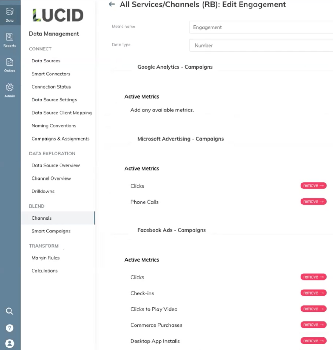
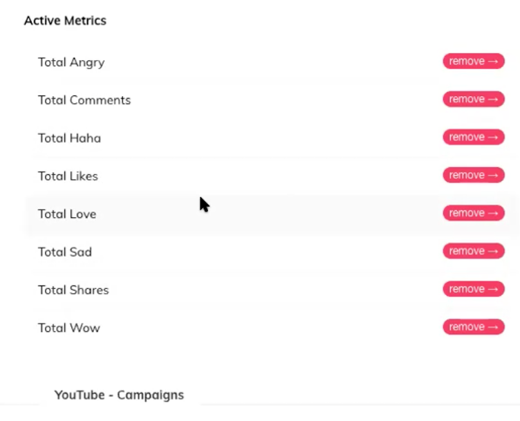
Once that custom metric is defined, it will be available in TapClicks forever, with updated data, so you never have to manually add up those engagement metrics again in order to report on them.
In any dashboard or report you build in the future, you can just drop in the metric Total Social Engagement (or a graph of this metric over time) and TapClicks will automatically calculate it based on how you defined it and have the number or graph ready for you.
This is a huge time saver.
Easily Set Up Repetitive Calculations
In addition to defining custom metrics, you can also automate more advanced calculations in TapClicks.
For example, if you are a tire manufacturer and you want to view your data by brand, but you have multiple ad campaigns running for different brands, you can set up advanced calculations that find the specific brand names in the campaign names and aggregate stats across all of these into single metrics for that specific brand.
In our example below, we can see that there are 266 Facebook Ad campaigns, all pulling in data from our data sources.
We've decided to name a certain segment of those campaigns HNP Campaigns' (see arrow on the right-hand side).

This means we can now pull data for just those HNP campaigns into any report or dashboard we want to create.
In this example, there are 191 of them and it pulls the data for all of those campaigns into one line (see arrow on the right-hand side).

You can use this function to group and view data by all types of location or by any segment you like product, campaign type, or group, and zoom in and out as you need to.
You can also calculate the overall click-through rate by adding up clicks across many campaigns and dividing by total impressions. You could calculate cost per click for campaigns across a region or specific product lines by adding up total spend and dividing by total clicks. The possibilities are endless and are not something that could be achieved by a simple data pipeline tool that only cleans up or transforms data fields.
And, as with everything in the TapClicks solution, you only have to set these up once. From there, calculated metrics are up-to-date and ready for you to report on every week or every month.
TapClicks Integrates with Other Data Visualization Tools
While TapClicks handles the entire marketing data process including creating data visualizations, you can also use our solution to integrate with other data visualization tools, if you prefer.
For example, you could use TapClicks to collect and store your data and have it push the up-to-date data to another analytics platform such as Tableau or Google Sheets. You can read more about TapClicks integration with Google Sheets in this article. We've included Tableau in our round-up.
Want to Try TapClicks as Your All-in-One Marketing Data Visualization Tool?
As well as allowing marketers to create powerful data visualizations and send them in reports to clients and stakeholders, TapClicks fulfills the 3 other essential steps a marketer needs:
- Gathering data from all data sources.
- Storing that data in a single and accessible data warehouse.
- Allowing you to do advanced calculations.
It does this automatically in one easy-to-use solution that's marketer-friendly and scalable.
If you're interested in how TapClicks could work as a marketing data visualization tool for your organization, you can try it free for 14-days or schedule a demo to learn more.