
15 Types of Data Visualization That Drive Better Decisions
Raw data alone doesn’t help people make decisions. It’s the way we present those numbers that creates meaning.
That’s where data visualization comes in. When teams use the right chart or graph, they spot trends faster, compare results more clearly, and explain what matters without needing extra words.
The way a visual representation simplifies complex data is what helps marketers, analysts, and executives act with more confidence.
In this article, you’ll learn about 15 types of data visualization and when to use each one.
What is Data Visualization?
Data visualization turns information into visuals that people can quickly understand.
Charts, graphs, and diagrams replace rows of numbers to help you highlight patterns without needing to scan entire spreadsheets.
Teams use visuals to communicate faster, align on goals, and present findings with more clarity. In today’s data-driven environment, seeing data in context often leads to faster, more confident decisions.
The practice of data visualization connects directly with fields like data science and data analytics. A strong visual format supports quicker decisions, deeper insights, and clearer presentations. These tools have a central role in day-to-day operations, planning, and reporting.
Different types of data visualization tools help professionals across industries turn raw input into actionable output. Here are five popular categories:
-
Dashboard builders - Combine charts, metrics, and visuals in one place for faster reviews.
-
Business intelligence (BI) platforms - Handle deep data analysis and help users manage large datasets.
-
No-code data visualization platforms - Help marketers and teams build visuals using simple drag-and-drop tools.
-
Real-time analytics tools - Show data as it happens for quicker action.
-
Project management visualization tools - Help teams track progress, measure performance, and plan future steps.
15 Essential Data Visualization Charts and Graphs
A strong graphical representation turns raw input into something clear and useful. Charts help teams understand numerical values, track patterns, and communicate results without confusion.
Each chart has a specific role, and choosing the wrong one can lead to misunderstandings or missed signals. The list below covers the most effective chart types for explaining trends, comparisons, and complex processes in business, marketing, and reporting.
1. Bar Chart
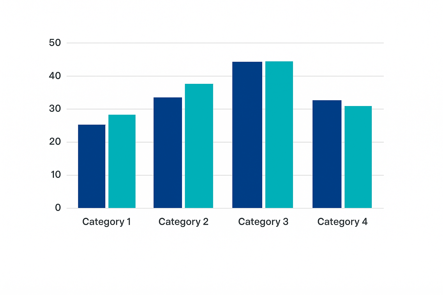
A bar chart compares values across categories using rectangular bars. Each bar represents a specific total, making it one of the clearest ways of presenting data.
It works best for categorical data with discrete values, such as product types, campaign names, or customer segments. A bar graph makes group comparisons simple, especially when tracking performance across different categories.
When breakdowns within each group matter, a stacked bar chart helps show how parts contribute to the whole. Teams further use it when visualizing data for reports, dashboards, or day-to-day metrics.
Other uses of bar charts:
-
Compare values - Show totals for each category.
-
Highlight segments - Stack values to show how each part adds up.
-
Track changes - View shifts across time periods.
-
Simplify review - Make group data easier to read at a glance.
2. Line Chart
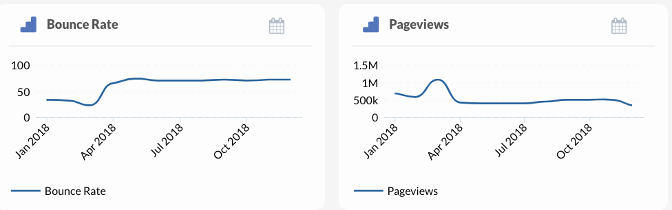
A line chart connects a series of data points across a continuous scale to show how values rise or fall over time.
Each point marks a recorded value, and the lines between them help highlight patterns that might not stand out in tables or raw formats. Marketing agencies rely on this chart when spotting trends across weeks, months, or years.
The line graph works best for visualizing time series data, such as sales over quarters, web traffic by day, or ad spend by month. The simple structure helps decision-makers track progress and react to dips or spikes without needing long explanations.
Use a line chart to:
-
Track trends - Watch values shift across time.
-
Spot patterns - Identify peaks, drops, or flat periods.
-
Measure impact - Compare before-and-after results.
-
Show continuity - Link events to specific data movement.
3. Pie Chart
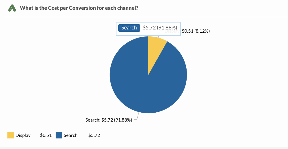
A pie chart divides a circle into slices, where each slice shows a category’s share of the total. The full chart always equals 100 percent.
Each slice connects directly to a percentage, which makes the format ideal for showing how categories compare as parts of a whole.
You could use pie charts to break down marketing spend, customer demographics, or revenue sources. A smaller number of slices keeps the chart easy to read. Too many categories or similar values reduce its clarity and make the visual harder to understand.
It works best when the goal is to highlight one group’s dominance or show a simple split. Pie charts support presentations, dashboards, and quick reviews where viewers need a basic summary without detail-heavy comparisons.
Use a pie chart to:
-
Break down totals - Show how one value splits across categories.
-
Compare group sizes - Spot the largest and smallest contributors.
-
Support visual summaries - Include simple overviews in reports.
-
Present clear proportions - Focus attention on the relative size of each part.
4. Scatter Chart (Plots)
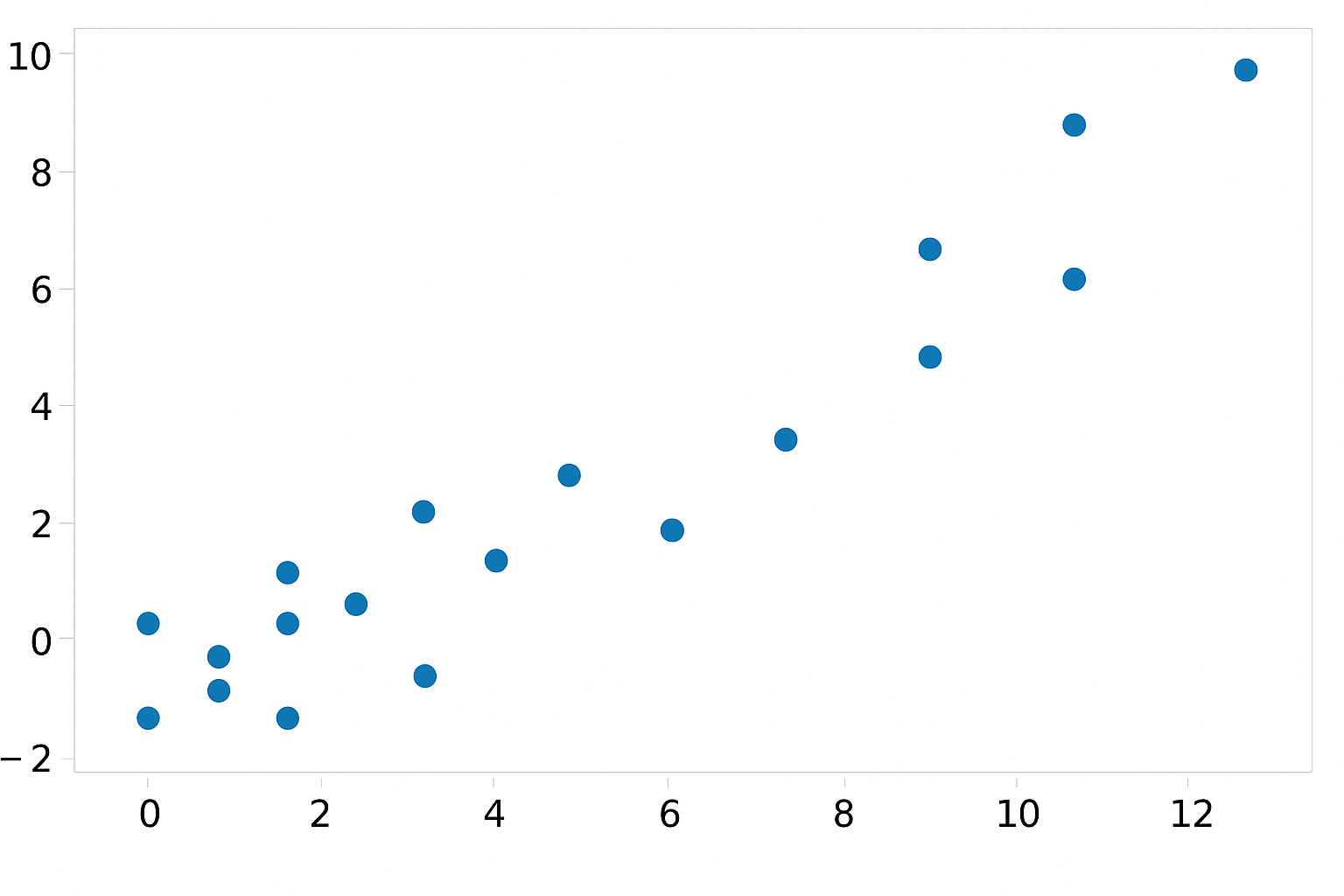
A scatter chart shows the relationship between multiple variables by placing individual points on a grid. Each point represents a set of values on the horizontal and vertical axes.
When placed together, the points form patterns that help identify clusters, gaps, or possible correlations.
Analysts use this chart to look for trends between inputs and outcomes, such as ad spend and conversions or website visits and signups. It helps teams test ideas, explore potential relationships, and investigate outliers that may affect overall performance.
Scatter plots work best when comparing numerical inputs across different conditions. For example, a chart could display product price on one axis and customer satisfaction on the other.
The chart helps answer whether an increase in one value impacts the other.
Use a scatter chart to:
-
Compare variables - Plot two sets of data to reveal connections.
-
Explore correlations - Find whether changes in one value align with another.
-
Investigate outliers - Spot unexpected results in large groups.
-
Test relationships - Check how paired values behave across categories.
5. Heat Map
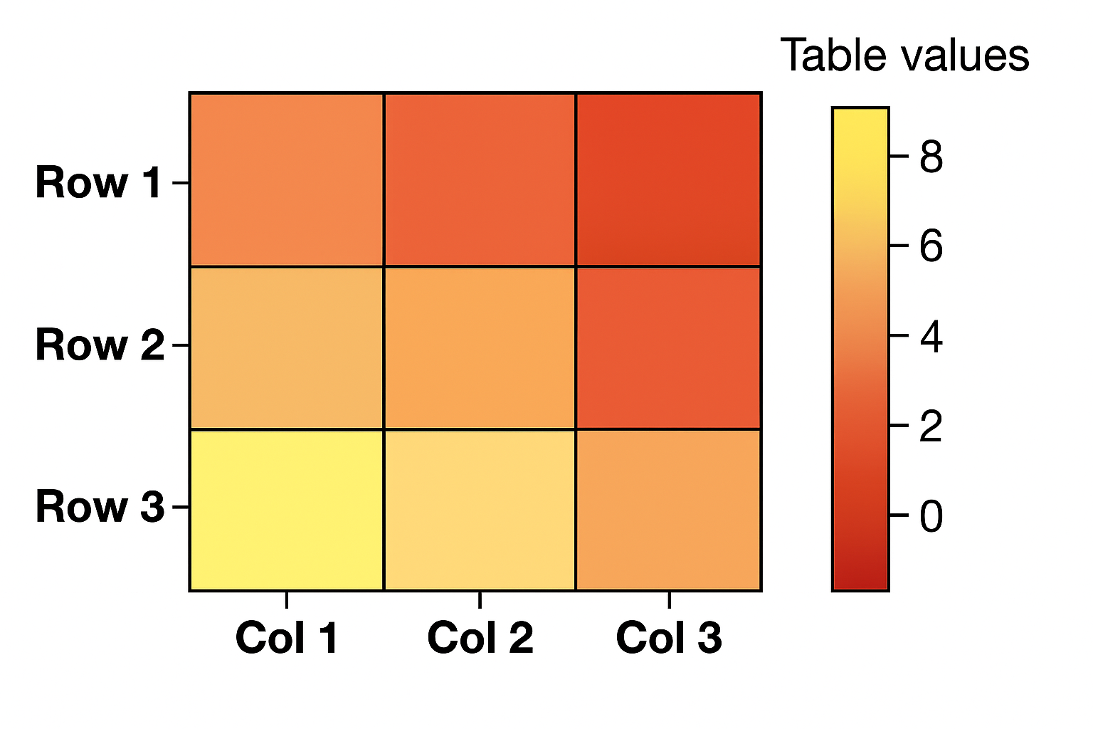
A heat map uses color to show differences in value across a grid. Darker or brighter shades signal higher or lower values, making this format useful for spotting patterns quickly.
The layout often mirrors a table but replaces numbers with visual cues, which help you notice trends without needing to read every figure.
In analytics dashboards, these maps display performance over time or across categories, such as campaign success by day and channel.
Color intensity reveals which areas need attention and which ones perform well.
Use a heat map to:
-
Highlight engagement - Show activity across web elements or campaigns.
-
Find weak spots - Spot low-performing segments at a glance.
-
Compare time periods - Use color to track shifts in value over days, weeks, or months.
-
Support fast decisions - Share insights visually without long explanations.
6. Area Chart
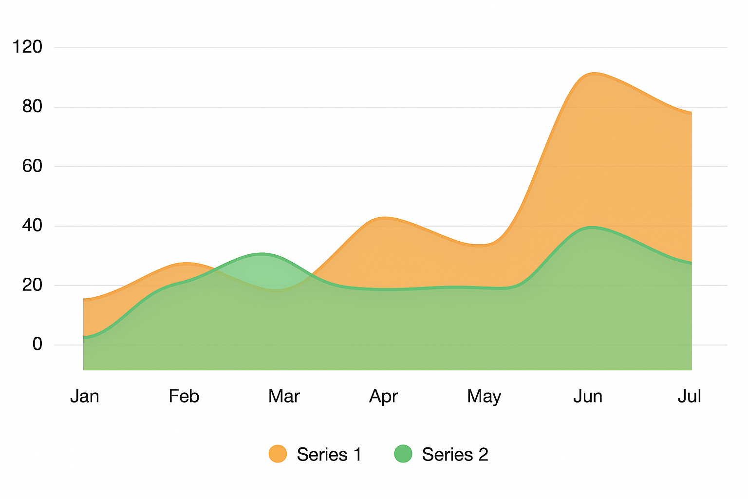
An area chart shows how totals shift over time by using filled space beneath a line. The shape and color draw attention to both value and scale.
Teams choose this format when they want to highlight growth or track cumulative change. Unlike a basic line chart, this version shows both the direction and size of movement.
Area charts display numerical data that follows a natural flow, such as product signups, ad impressions, or sales over time. The smooth shape makes it a strong choice when working with continuous data across weeks, months, or quarters.
Marketers and analysts use it to spot changes in data distribution, track momentum, and compare stacked values across segments. When the chart uses more than one dataset, it still keeps the focus on the total.
Use an area chart to:
-
Show overall growth - Display how totals increase or drop across time.
-
Break down layers - Stack values and track how each part changes.
-
Compare totals - Align different groups along the same axis.
-
Work with trends - Use for time series data where values shift gradually.
7. Gantt Chart
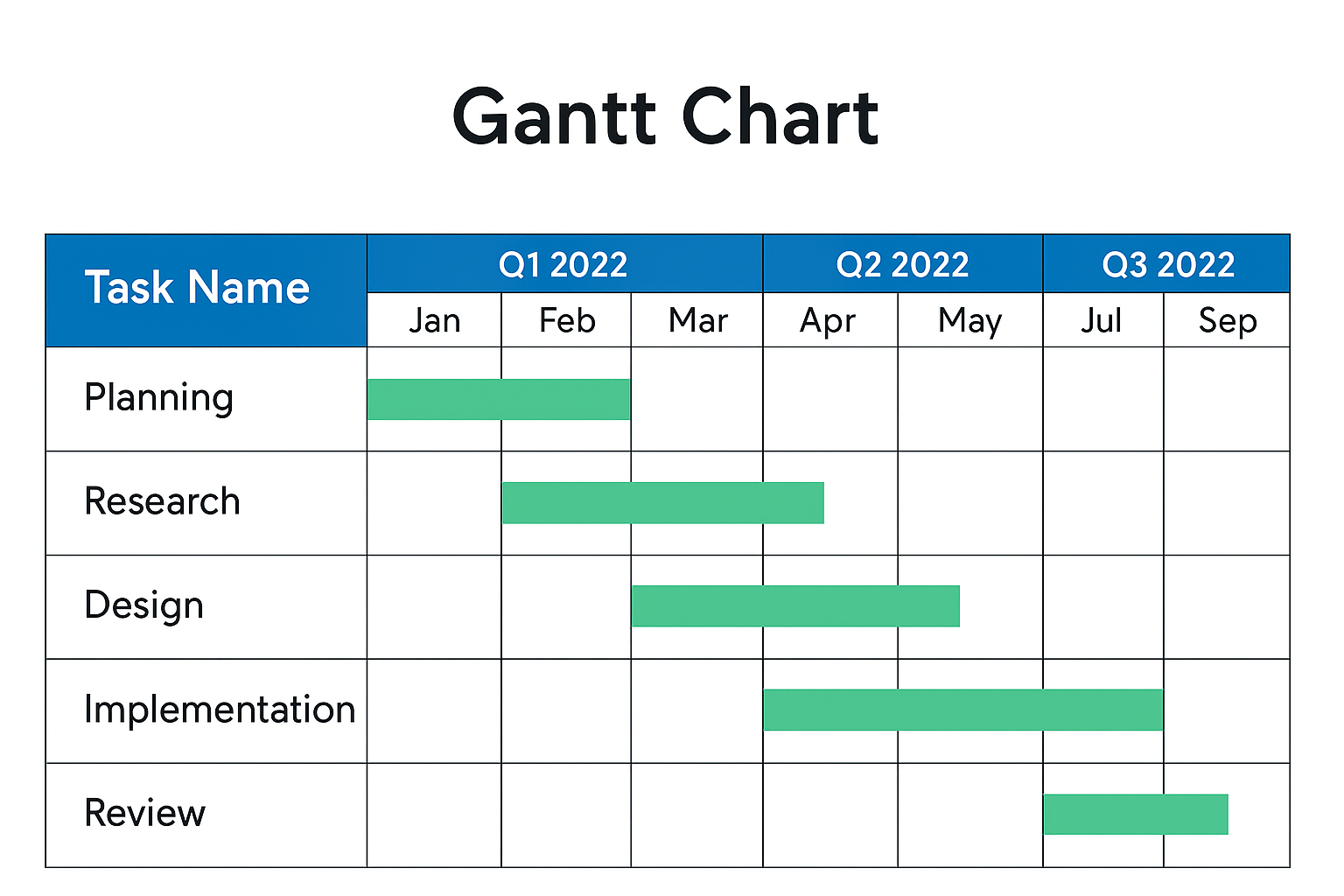
Gantt charts help teams map out work across time using horizontal bars.
Each bar shows the start and end date of a task, helping planners line up timelines and track activity from beginning to end. The layout supports time-based planning where sequencing and duration matter most.
The left side of the chart includes a vertical axis that lists tasks in order. To the right, the bars stretch across a calendar view, which makes it easy to show project tasks, track deadlines, and adjust work as needed. Managers rely on this structure to monitor project progress during each phase.
Common uses for a Gantt chart include:
-
Coordinating task timing - Schedule overlapping or dependent activities.
-
Tracking multiple phases - Break projects into organized sections.
-
Managing accountability - Assign timelines to team members or departments.
-
Adjusting in real time - Shift bars as priorities or resources change.
8. Bubble Chart
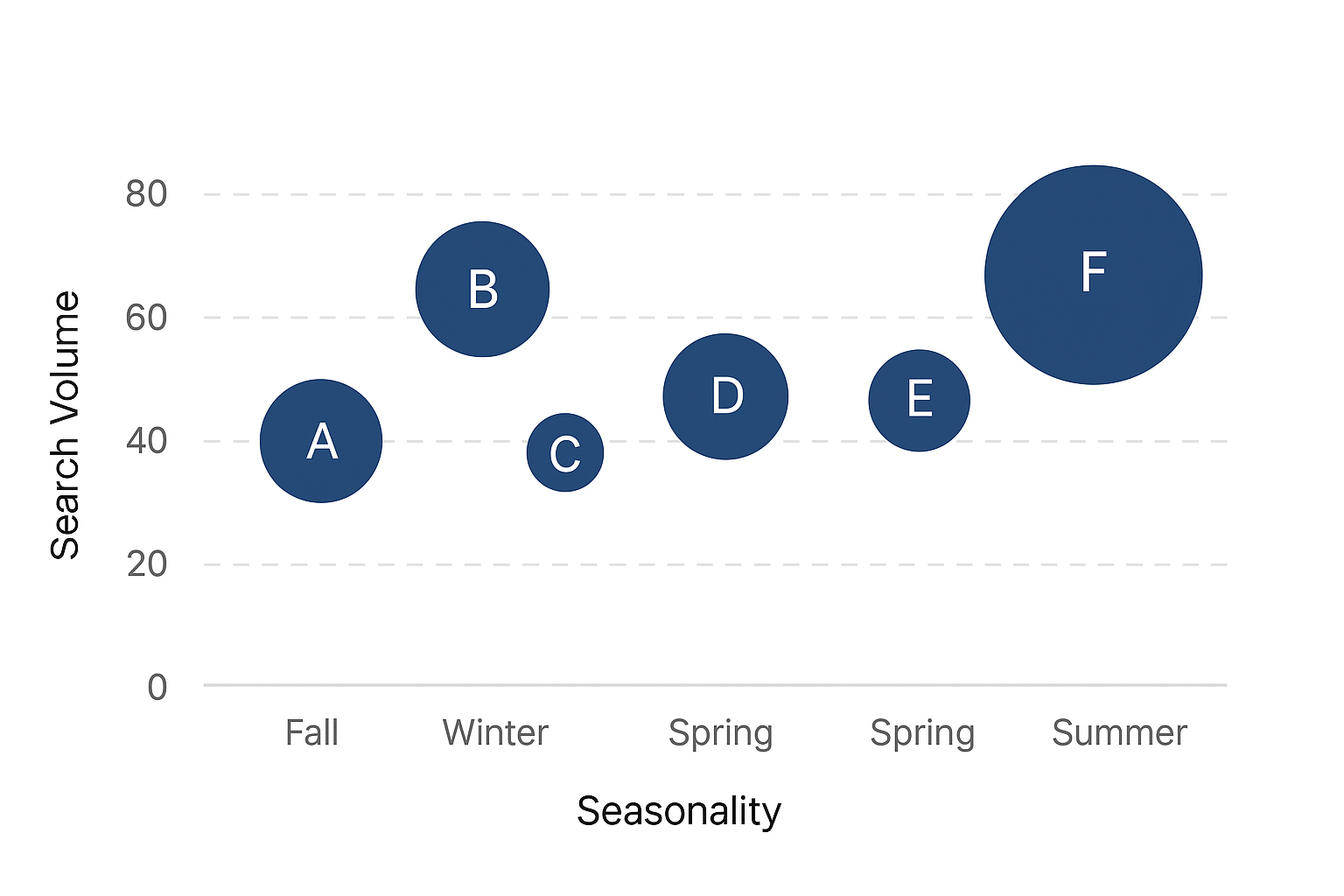
A bubble chart shows relationships between values by plotting circles across a grid. Each bubble’s position reflects two numbers: one on the x-axis and one on the y-axis.
The size of the bubble adds a third value so that it’s easier to compare multiple variables in one view.
Analysts choose this format when tracking more than one variable at once, like ad spend, return, and campaign reach.
Larger bubbles often stand out and draw attention to high-impact items. Each circle stands for one case or group, and the chart helps reveal patterns that standard bar or line charts might miss.
The chart includes individual data points, but unlike a scatter plot, the bubble size carries extra meaning. That makes it a good fit for market analysis, performance comparisons, and custom dashboards.
A bubble chart works well when the goal is to:
-
Compare three values - Plot location and size at once.
-
Spot outliers - Identify bubbles that fall far from the rest.
-
Visualize influence - Show how a third factor shifts the results.
-
Analyze grouped data - Focus on trends across categories or segments.
9. Tree Map
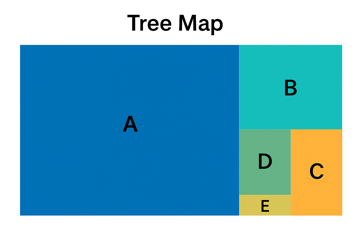
Tree maps organize space into nested rectangles that show how parts relate to a larger whole. Each rectangle reflects size based on value, making it easy to compare segments at a glance.
The layout works best for showing hierarchical data with grouped categories and subcategories. Every section uses shape and color to represent data values, so larger blocks reflect bigger portions.
These maps work well when summarizing large datasets where each block ties to a numerical data point, such as revenue by region or cost by department.
Tree maps make it easier to spot dominant sections and underperforming groups without needing rows or columns. The compact layout fits well into dashboards and reports that need both structure and space.
Common uses for a tree map include:
-
Breaking down categories - Group values under parent topics.
-
Spotting dominant segments - See which areas take up most of the total.
-
Comparing proportions - View all parts of a whole in one space.
-
Organizing reports visually - Present clean summaries with depth.
10. Sankey Diagram
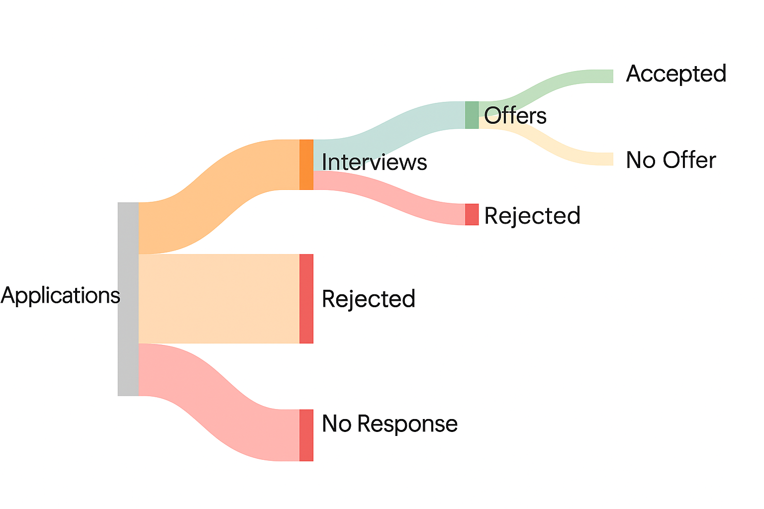
A Sankey diagram shows how values move from one stage to another using curved lines that vary in thickness.
The width of each line reflects the size of the flow, which makes this format ideal for visualizing complex processes such as budget allocation, traffic movement, or customer conversion paths.
Each path links categories or actions and helps highlight patterns in how inputs shift through a system. For example, teams can trace how leads flow from ad clicks to purchases or how resources move across departments. The visual structure quickly draws attention to inefficiencies or drop-off points.
While it differs in style, the Sankey format shares the same goal as a flow chart to simplify process mapping and show where things move.
The Sankey layout adds value by tying each transition to measurable data, making both the direction and size of movement clear.
A Sankey diagram is helpful for:
-
Tracking input to output - Follow where values come from and where they go.
-
Finding loss points - See where the value drops or splits.
-
Analyzing systems - Break down the flow between multiple steps.
-
Supporting decision reviews - Explain how and where key changes happen.
11. Radar Chart (Spider Chart)
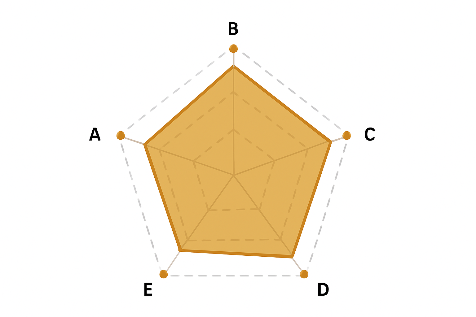
Radar charts plot values on a circular grid, with each axis standing for a different metric.
As the data spreads outward, lines connect the values and form a shape that reflects the overall performance. The visual makes it easier to compare patterns across several categories.
Teams use radar charts when reviewing multivariate data that shares the same scale. For example, a marketer can evaluate reach, engagement, conversion, and cost in one view.
Overlaying results for two or more variables, like campaigns or departments, shows where each one leads or lags.
It helps explain balance and consistency. A tight, even shape suggests steady performance. A jagged one signals gaps that may need attention.
Radar charts are useful when:
-
Ranking attributes - Assess multiple traits or outcomes together.
-
Comparing performance - View how different options stack up.
-
Finding weaknesses - Spot low scores across categories.
-
Visualizing balance - Identify uneven or strong patterns across a shared scale.
12. Network Graph
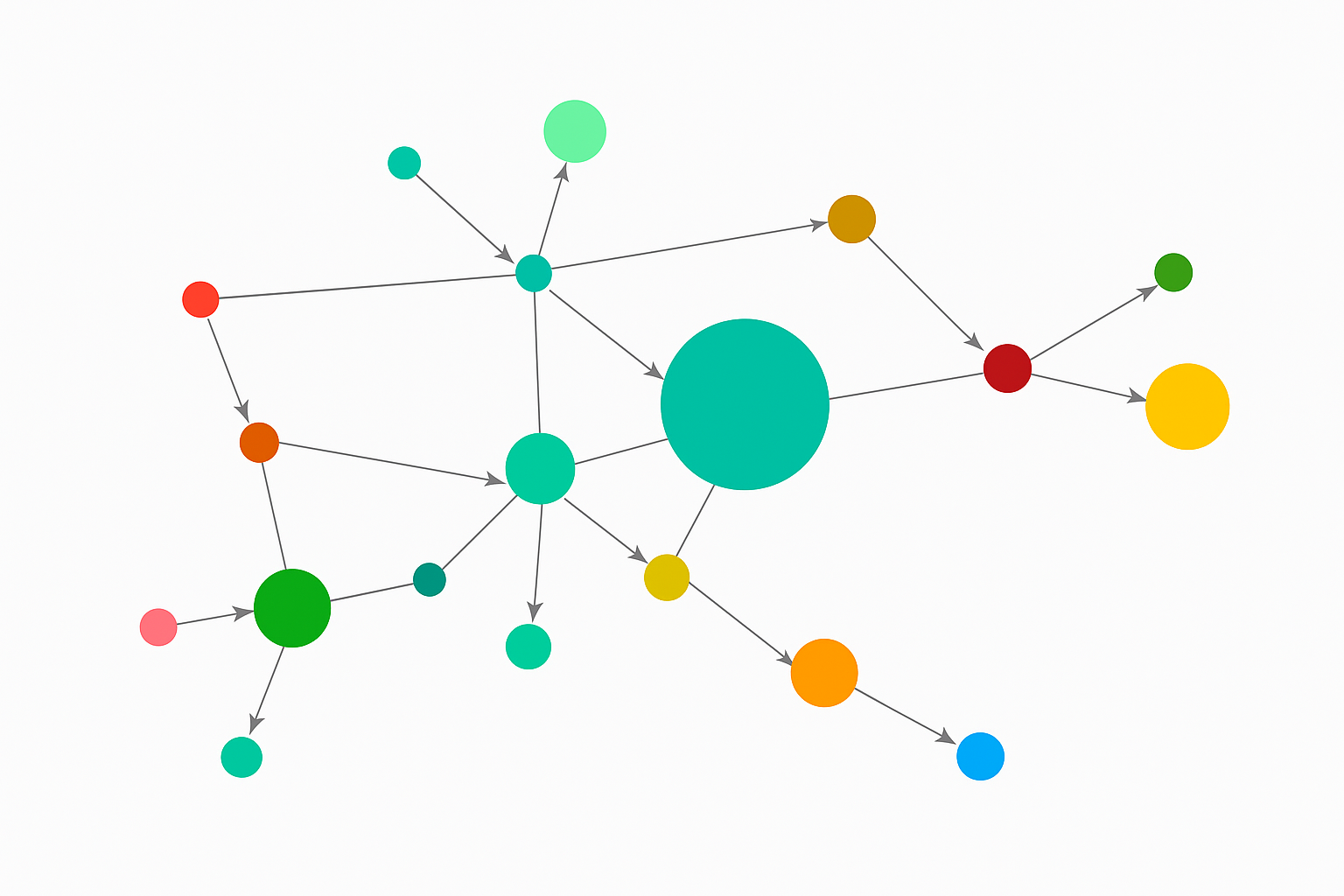
Network graphs display how items connect by using nodes and links. Every node stands for a person, object, or data point, while the lines (or edges) show the relationships between them.
The layout doesn’t follow a standard grid but is arranged based on how strong or frequent the connections are.
Data analysts turn to network graphs when working with complex data that involves relationships or dependencies, such as customer behavior, web traffic paths, or team structures.
These charts help emphasize patterns that don’t show up in isolated datasets, like clusters of frequent interactions or weak connection points.
This format supports both overview and detail. It shows the big picture of how things relate while still letting you zoom in on specific nodes or subgroups.
Network graphs make sense when the goal is to:
-
Map relationships - Show how individuals or systems connect.
-
Spot clusters - Identify tightly grouped segments.
-
Uncover gaps - Reveal missing or weak connections.
-
Analyze behavior - Trace paths or flows between linked elements.
13. Gauge Chart
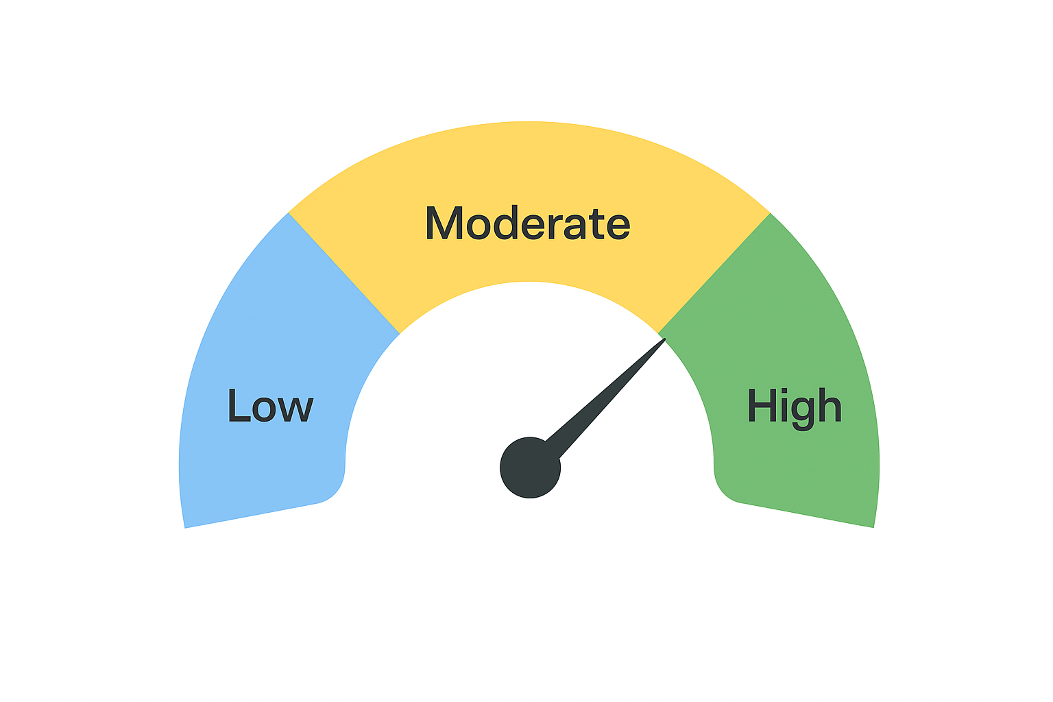
Gauge charts show progress toward a goal using a dial or needle inside a circular display. Most often, the chart displays a single value against a defined range, such as 0 to 100 percent.
Businesses rely on gauge charts to track key performance indicators, like daily sales, response time, or system uptime. The needle moves as the value changes, instantly signaling how close the metric is to the target.
A gauge chart works best when presenting a quick snapshot rather than a detailed analysis. The bold visual representation helps highlight status without needing extra labels or context.
Common use cases include:
-
Displaying live performance - Show real-time status for a tracked metric.
-
Setting targets - Define zones for low, medium, and high performance.
-
Reporting summaries - Add a clean visual to dashboards and executive reports.
-
Emphasizing results - Draw focus to important progress metrics.
14. Waterfall Chart
Waterfall charts explain how a total changes across a series of steps. Bars show increases and decreases separately, so it’s easy to see what adds to the total and what subtracts from it. Viewers can follow how a value moves from a starting point to an ending result without scanning raw numbers.
The format works well for presenting data that involves gains and losses, such as budget changes, revenue breakdowns, or inventory shifts. Unlike other charts that show only totals, a waterfall chart lays out the path in clear visual stages.
Every bar connects to a numerical value, with color or position indicating direction. In business reports, the chart helps teams focus on what created the outcome, not just the end number.
Waterfall charts work best to:
-
Show step-by-step impact - Reveal how actions affect totals over time.
-
Separate positive and negative changes - Make movement across categories easy to read.
-
Compare contributions - Display the size of individual factors side by side.
-
Support performance reviews - Explain financial shifts or project updates with clarity.
15. Funnel Chart
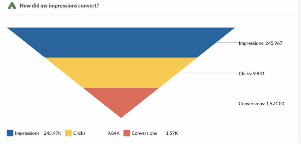
A funnel chart shows how values decrease across stages in a process. The shape narrows from top to bottom, with each section representing a step. The width reflects the amount remaining at each point, so it’s easy to see where the biggest losses happen.
Sales and marketing teams use funnel charts to track conversions, leads, or customer actions. The format gives a quick view of how many users continue from one step to the next, and where they stop. It works well for signup flows, sales pipelines, or onboarding sequences.
Every stage uses a simple visual format, making comparisons easy without needing extra detail. A data analyst can review drop-offs and suggest where to test changes or focus efforts.
Choose a funnel chart to:
-
Measure step-by-step retention - Show how many users continue through each phase.
-
Find weak spots - Identify where interest drops.
-
Support conversion tracking - Focus on how users move toward a goal.
-
Report process efficiency - Show how well stages retain users or revenue.
How to Visualize Marketing Data Based on the Questions You Ask
The chart you choose depends on the question you need to answer. Some formats compare totals, others show trends, or highlight parts of a whole. Start with the question, then pick the chart that makes the answer clear.
1. How Do You Compare Values in Marketing Data?
Marketers often ask, “How do I compare values?” In day-to-day analysis, it can mean comparing results across time periods, channels, campaigns, or audience groups.
Common business questions:
-
How much did SEM spend in the last 12 months compared to the previous year?
-
How does social engagement differ by gender?
-
Are conversions and goals increasing or decreasing?
-
How do customer counts relate to total revenue?
-
What’s the cost per click?
-
What’s the cost per impression?
These questions all aim to place one number next to another to measure change or performance. Whether it’s budget tracking or campaign reporting, the goal is to understand how values stack up.
Bar charts and column charts are ideal for these comparisons. They organize information in a clear format and make differences obvious at a glance.
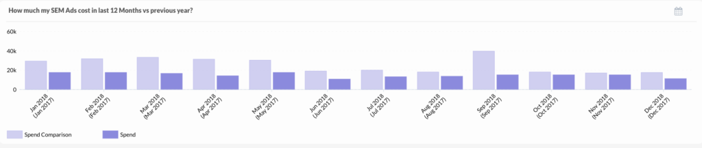
Take SEM spend as an example. A two-bar comparison instantly shows that spending fell this year. That’s faster and more useful than scanning 24 months of data.
2. How Do You Show How Individual Parts Contribute to the Whole?
Many marketers also ask, “How can I see how each part of a total performs?” It usually relates to audience segments, traffic sources, or channel breakdowns.
Common business questions:
-
What share of traffic comes from each source?
-
Which social channel generated the most leads?
-
How are visitors divided by age or gender?
-
What’s the breakdown of social engagement by platform?
-
How has each marketing channel contributed over time?
These questions focus on how smaller pieces fit into a complete picture. Pie charts, stacked bar charts, and area charts work well for this purpose.
Consider the question about marketing channels. A pie chart shows which ones lead and which ones lag. If direct traffic drives most results, that slice stands out. The rest show where gains may be possible.
3. How Do You Visualize Trends in Your Data Over Time?
Trend-based questions help marketers understand direction and timing. These questions focus on growth, decline, or patterns across time.
Some business questions:
-
How many conversions happened month by month?
-
How does engagement relate to impressions over time?
-
Are page views and user interactions increasing together?
-
Did fan growth change compared to the previous year?
-
What are the monthly trends for leads, trials, and signups?
Line graphs, dual-axis charts, and column charts make it easy to see progress or drops across time. The right chart shows what changed, when it changed, and how fast it moved.
A line chart works well for comparing fan counts over two years. The upward or downward curve shows what you need to know right away.
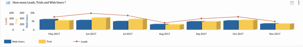
When comparing three values like leads, trials, and users, a dual-axis or stacked column chart gives a better view. You can see totals and compare segments without losing clarity.
Find the Right Visual Representation for Every Metric With TapClicks

TapClicks gives marketers the tools to visualize data clearly and act faster. Each chart supports a specific question or goal.
-
Big number - Call out key metrics like clicks or conversions.
-
Data grid - View detailed tables for account-level insights.
-
Bar chart - Compare values by channel, campaign, or audience.
-
Line chart - Show trends like revenue or traffic over time.
-
Combo chart - Mix metrics like cost and return in one view.
-
Pie chart - Break down budgets or audience segments.
-
Funnel chart - Track user flow and drop-offs across stages.
-
Gauge chart - Monitor progress toward monthly goals.
-
Bubble chart - Analyze three variables in one chart.
-
Geo chart - Map performance by region or location.
TapClicks turns complex marketing data into visuals that drive smarter decisions.
FAQs About Types of Data Visualization
What are the four main visualization types?
The four main types are temporal, hierarchical, multidimensional, and network-based visualizations. Each supports a different purpose, from tracking time-based patterns to conducting spatial analysis in maps or location-based data.
What are the three types of data visualization?
The three types are exploratory, explanatory, and monitoring visuals. Exploratory charts support data exploration, explanatory visuals help present key insights, and monitoring visuals track real-time performance.
What are the five data visualization techniques?
The five techniques include comparison, distribution, composition, relationship, and trend analysis. Each technique helps simplify data into a clear visual, often supported by charts, graphs, or summary statistics.
What are the big three of data visualization?
The big three are bar charts, line charts, and pie charts. These formats appear most often in business reporting due to their clarity, versatility, and ability to present data simply.