Marketing Analytics
AI Marketing Dashboards: How to Cut Reporting Time and Surface Insights That Actually Get Used
How AI Insights Agents automate reporting, flag anomalies, and turn raw campaign data into decisions your team can act on.
An AI marketing dashboard uses machine learning to automatically pull data from your ad platforms and analytics tools, flag anomalies, write plain-language summaries, and recommend next steps — replacing the manual work of exporting spreadsheets and typing up commentary by hand. That shift is no longer a nice-to-have. AI now touches some part of the workflow at 86.4% of marketing teams, and 32.96% of marketers say they're already using AI extensively for data analysis and automated reporting, according to HubSpot's 2026 State of Marketing report.
If your team is still building reports by hand, this is the guide for closing that gap: what an AI dashboard actually is, why teams are adopting them now, how to build or choose one, and where they tend to go wrong.
One agency cut a 10-hour reporting task down to 20 minutes by connecting an AI agent to its marketing data — a concrete example of the shift happening across the industry right now (Supermetrics, 2026).
What Is an AI Marketing Dashboard?
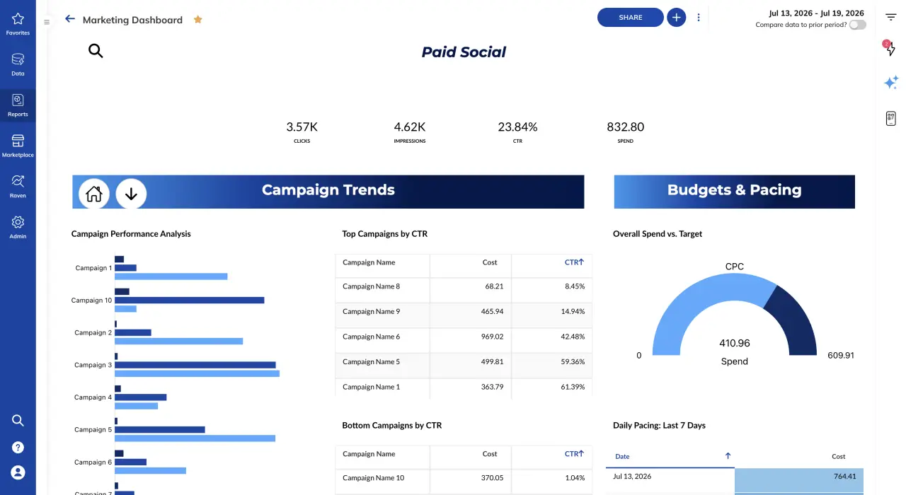
An AI marketing dashboard is a reporting interface that doesn't just display metrics — it interprets them. Instead of a grid of numbers you have to analyze yourself, an AI dashboard connects to your data sources, watches for statistically meaningful changes, and generates written or visual explanations of what happened and why it matters.
The distinction matters in practice. A traditional dashboard shows you that click-through rate dropped 18% last week. An AI dashboard tells you that CTR dropped 18% on your Meta campaigns specifically, that the drop coincides with a creative rotation on July 28, and that similar drops in the past resolved within five days once new creative was introduced. One is a chart. The other is a starting point for a decision.
Why AI Dashboards Are Replacing Static Reports in 2026
Three forces are pushing marketing teams away from manually assembled reports.
Adoption has crossed the tipping point. Nearly a third of marketers (32.96%) now say they use AI extensively for data analysis and automated reporting, and 86.4% use AI in some part of their marketing workflow, per HubSpot's 2026 State of Marketing report. Manual reporting is increasingly the exception, not the norm.
The time savings are documented, not theoretical. Supermetrics customer Layer used an AI agent connected to its marketing data to cut a 10-hour reporting task down to 20 minutes, and Supermetrics reports its AI agent frees up more than 15 hours per month per marketer on recurring reporting work (Supermetrics, 2026). That time goes back into strategy and client-facing work instead of copy-pasting export files.
Static dashboards create noise, not clarity. Agency dashboards routinely surface 40-plus metrics per client, but clients typically engage with only a handful of them — the rest is noise that signals the team hasn't identified which numbers actually drive decisions (Layer Five, 2026). AI dashboards are built to solve exactly this problem: instead of dumping every available metric on a page, they're designed to surface the handful that changed and explain why.
The Metrics Nobody Reads: Why More Data Isn't Better
The standard fix for "our reports aren't landing" used to be adding more metrics. More channels, more breakdowns, more tabs. That approach is backwards. When a dashboard reports 40 metrics and a client only looks at four, the other 36 aren't adding value — they're adding friction, because someone still has to scan them, decide none of them matter, and move on (Layer Five, 2026).
AI-native reporting flips the model: instead of asking a human to scan everything and decide what matters, the system scans everything and tells you what changed. That's the core function of TapClicks' AI Insights Agents — they continuously analyze campaign performance across every connected data source, identify statistically meaningful trends and anomalies, and surface only the observations worth a human's attention, instead of leaving that triage work to whoever opens the dashboard.
How to Build an AI Marketing Dashboard: 6 Steps
Whether you're evaluating a platform or configuring one you already have, the same sequence applies.
- Unify your data sources first. AI insights are only as good as the data feeding them. Before adding any AI layer, connect every channel — paid, organic, social, CRM, call tracking — into a single data model. TapClicks does this through more than 12,500 SmartConnector integrations, giving marketers one unified view instead of a login for every platform.
- Define one north-star metric per client or program. AI can surface anomalies across 40 metrics, but someone still has to tell it which outcome matters most — revenue, pipeline, qualified leads, cost per acquisition. Set that before you turn on automated insights, not after.
- Turn on anomaly detection, not just automated pulls. The value of an AI dashboard isn't that it refreshes data faster — plenty of connectors do that. The value is that it flags what's statistically unusual without a human having to eyeball every chart every week.
- Let AI draft the narrative, then edit it. Writing commentary — "spend was up 12% driven by X" — is the most time-consuming part of reporting and the easiest to automate. TapClicks' AI Agents in Report Studio embed AI-generated insights directly into client-ready reports, cutting the manual-commentary step out of the process entirely.
- Automate the client-ready output. Insights that stay inside an internal dashboard don't move the needle for clients or executives. Tools like TapClicks' SmartSlides turn AI Insights Agent output directly into stakeholder-ready presentations, so the same analysis that flagged an anomaly also becomes the slide explaining it.
- Close the loop with delivery, not just access. Dashboards that require someone to log in and go looking for insights get checked less often than ones that push insights to where people already are — inbox, mobile, Slack. This is the logic behind AI-driven delivery tools like SmartEmail, which sends insights straight to stakeholders instead of waiting for them to open a dashboard.
4 Use Cases: What AI Dashboards Actually Do Day-to-Day
Automated client reporting for agencies. Instead of an analyst spending a day before each QBR building slides, an AI Insights Agent analyzes the month's performance, and a tool like SmartSlides auto-generates the presentation with the narrative already written. The analyst's job shifts from building the report to reviewing and adding strategic context.
Anomaly and budget-pacing alerts. Rather than discovering a tracking break or a budget overspend during a weekly check-in, AI agents monitor spend, conversions, and pacing continuously and flag deviations as they happen — closer to real time than to "we'll catch it Monday."
Cross-channel performance benchmarking. With every data source unified through SmartConnectors, AI agents can compare performance across Google, Meta, LinkedIn, and other channels in a single narrative, instead of a marketer manually reconciling exports from five different ad platform UIs.
Plain-language executive summaries. Not every stakeholder wants to read a dashboard. AI-generated executive summaries — a capability TapClicks has built directly into dashboard reporting — translate the underlying data into a short narrative a CMO or client can read in under a minute.
See AI Insights Agents in Action
Watch how TapClicks AI Insights Agents analyze campaign data and surface anomalies automatically.
Want this running on your own dashboards? Explore TapClicks AI.
AI Dashboards vs. Traditional BI Tools: What's Actually Different
| Traditional BI dashboard | AI marketing dashboard | |
|---|---|---|
| Primary output | Charts and tables | Charts, tables, plus written insight and recommended action |
| Anomaly detection | Manual — a human has to notice | Automated — the system flags statistically unusual changes |
| Commentary | Written by an analyst, one report at a time | Drafted by AI, reviewed and edited by a human |
| Setup effort | Query building, manual chart configuration | Connect data sources; insights generation is largely automatic |
| Best fit | Teams with dedicated BI/analytics staff | Teams that need marketing-specific insight without a dedicated analyst for every account |
As Improvado's 2026 review of AI dashboard tools notes, not every "AI-powered" BI platform is actually built for marketing — many are general-purpose business intelligence tools with an AI layer added on, rather than systems built around marketing-specific data and workflows (Improvado, 2026). When evaluating tools, the question isn't just "does it have AI" — it's whether the AI understands marketing-specific concepts like channel attribution, pacing, and campaign structure, or whether it's a generic chatbot layered on top of a chart.
Common Mistakes When Adopting AI Dashboards
- Turning on AI insights before unifying data. If your data is still siloed across five platforms, AI-generated commentary will be partial and occasionally misleading. Fix the data foundation first.
- Treating AI output as final copy. AI-drafted commentary is a first draft, not a finished deliverable. It still needs a human who knows the account to check it against context AI doesn't have — a paused campaign, a client conversation, a seasonal factor.
- Keeping every legacy metric "just in case." Migrating to an AI dashboard is the moment to cut the 36 metrics nobody reads, not preserve them out of habit.
- Measuring adoption by dashboard views instead of decisions made. The point of an AI dashboard isn't more logins — it's fewer hours spent assembling reports and faster action on what the data shows.
FAQ
What is an AI marketing dashboard?
An AI marketing dashboard is a reporting tool that automatically pulls data from connected marketing platforms, detects meaningful changes or anomalies, and generates plain-language explanations and recommendations — rather than only displaying raw metrics for a human to interpret.
How much time can AI dashboards actually save on reporting?
Documented examples vary by team and use case, but Supermetrics reports one customer cut a 10-hour reporting task to 20 minutes using an AI agent connected to its marketing data, and estimates its AI agent frees up over 15 hours per month per marketer on recurring reporting (Supermetrics, 2026).
Do AI dashboards replace marketing analysts?
No. AI dashboards automate the mechanical parts of reporting — data pulls, anomaly flagging, first-draft commentary — but strategic judgment, client context, and final review still require a human. The role shifts from building reports to reviewing and acting on them.
What data sources can AI marketing dashboards connect to?
It depends on the platform. TapClicks connects to more than 12,500 data sources through its SmartConnector library, spanning paid media, organic, social, CRM, call tracking, and more, so AI insights can be generated across a client's full marketing stack rather than one channel at a time.
Is AI-generated dashboard commentary accurate?
It's accurate relative to the data it's given, but it should still be reviewed by someone with account context before it goes to a client or executive. Treat AI-drafted insights as a strong first pass, not a final answer.
Mitchell Mertz is Technical Marketing Manager at TapClicks.
Sources
- HubSpot, "2026 State of Marketing Report"
- Supermetrics, "AI-powered marketing reporting for agencies: 2026 guide"
- Layer Five, "Unified Client Dashboards for Marketing Agencies (2026)"
- Improvado, "12 Best AI Dashboards for Marketing Analytics (2026)"
- TapClicks, "TapClicks AI Platform Brings New AI Marketing Intelligence Capabilities to Automate Performance Reporting"
- TapClicks AI